REDIZ || Communication, Design, and Learning Through Redesign
Communication theory in the field of design / contemporary art
In design and contemporary art, communication theory explains how visual, spatial and interactive forms act as messages: how they are encoded by creators and decoded by audiences within specific contexts.
In this field, «language» is multimodal. Designers work with:
- Visual form — color, typography, layout, composition, imagery - Temporal form — interaction flows, micro‑animations, pacing of content - Social form — comments, reactions, community rituals, platforms
Each of these elements functions as a sign that communicates values, norms and emotional attitudes.
Semiotic approaches (Saussure, Peirce, Barthes, Eco) help to understand how signs operate. A rough edge in an illustration, a noisy collage texture, or a playful color name («Keks na ogorode») is not neutral — it positions the platform as experimental, non‑corporate, friendly to imperfection. Semiotics in a product like reDIZ guides the creation of a coherent visual language that says: «Here it’s safe to try, iterate and fail.»
Narrative approaches see design and platforms as stories. A junior designer’s path on reDIZ — from first task to visible portfolio growth — is a narrative arc. The UI, notifications, progress indicators, and public tasks together stage a story about becoming a designer: not overnight, but through a visible, shared process.
Pragmatic communication theories stress that meaning is produced in use, not only in static artifacts. For reDIZ this is crucial: the core message («practice, feedback, growth through redesign») is not just written in copy; it is embedded in affordances: - the ability to upload tasks and redesign them, - visible histories of growth, - the comment system as a place of dialogue rather than judgment. Socio‑cultural approaches (Hall, cultural studies) remind us that interpretation is historical and situated. reDIZ speaks to a specific culture: - young Russian‑speaking (or CIS) designers, - deeply online, - socialized through Telegram, Dribbble, Behance, VK communities, - suspicious of «fake cases» and «dribbblisation» of portfolios.
Visual codes like «designer noise», collage, and playful color names signal proximity to design meme culture, to not‑too‑formal, «Figma‑native» environments.
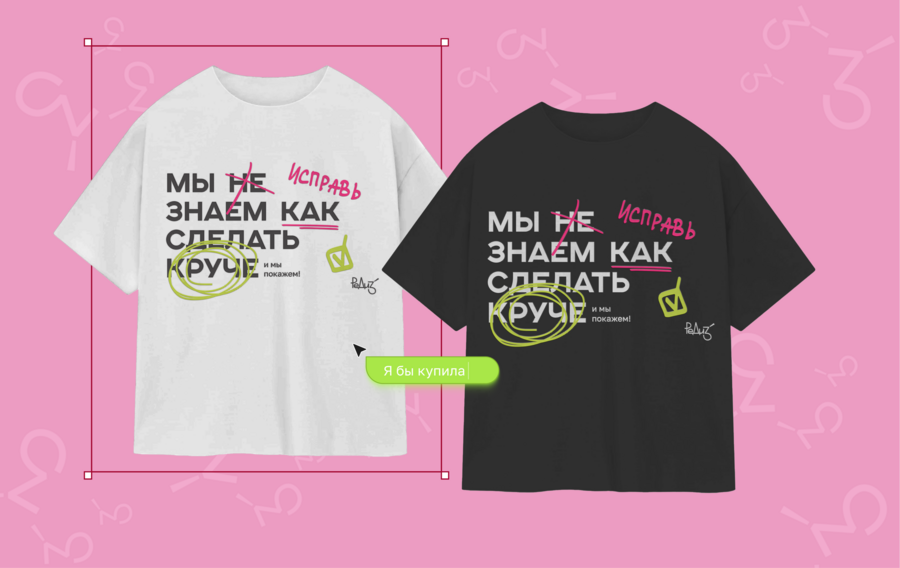
Visual code of brand represented through merchandise
Rhetorical and persuasive theories look at how form argues. Hierarchy, contrast, UI patterns, and copy all create an argument: - «Redesign is a legitimate, valuable way to grow.» - «You don’t need a client to build a serious portfolio.» - «You’re not alone; others struggle and practice like you.»
In reDIZ, persuasion is not only about acquiring users, but about reframing what «real practice» and «real portfolio» mean in the eyes of beginners and employers.
reDIZ stands exactly at this intersection: it uses communication theory to turn a learning platform into a cultural environment where redesign becomes a social, visible, and emotionally rewarding practice.
Presentation of reDIZ for a general audience
You’re learning design. You watch tutorials, repeat UI patterns from Dribbble, maybe take a course. But there’s a problem:
You still don’t have real projects. No clients, no cases, just exercises «in a vacuum». You’re not sure how to show your skills honestly.reDIZ is a platform and mobile app that turns redesign into your main training ground.
Instead of waiting for a «real brief», user:
- Takes existing works — apps, posters, websites, product pages. - Gets tasks from the community: what to improve, what to focus on. - Does your own redesign and publish it. - Receives comments and feedback from other designers. - Gradually builds a portfolio of real redesigns, not fictional startups.
promo banner from Rediz pitchdeck
What you can do in reDIZ
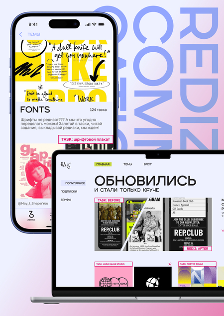
Showcase of main functions in REDIZ platform
1. Scroll the feed — See a stream of redesigns from other designers. — Filter by topics: UI, UX, branding, posters, etc. — Save ideas, follow people whose style you like.
2. Take tasks — Choose a task or upload your own original work to be redesigned. — Try your hand at the same brief as others and compare solutions. — Practice on «realistic» problems, not abstract drills.
3. Publish your redesigns — Upload your work, describe the idea, show «before / after». — Get comments, suggestions, and support from the community. — Feel the motivation boost when someone saves or follows you.
4. Build your portfolio — Your profile becomes a timeline of growth: from first attempts to strong, structured projects. — You can send this link to a potential employer or mentor. — They will see not just pretty shots, but your way of thinking.
5. Learn on the go — Short blog posts, breakdowns, tools and approaches are built into the app. — You can read while commuting, then immediately try something in a task.
Personal profile for building a portfolio through redesigns
Learning functions in REDIZ are realized through articles on the platform
Why this matters for you
- You practice regularly, not just watch tutorials. - You’re not alone: there is a community that understands your struggles. - You can see progress: how your old redesigns differ from new ones. - You get a portfolio you’re not ashamed to show — even without clients.
- You practice regularly, not just watch tutorials. - You’re not alone: there is a community that understands your struggles. - You can see progress: how your old redesigns differ from new ones. - You get a portfolio you’re not ashamed to show — even without clients.
reDIZ is not another dry educational platform. It’s a practice ecosystem for designers where the path, growth and process matter just as much as the final shots.
For professional audience:
reDIZ is a media platform and mobile app for early‑stage designers that positions redesign as the primary tool for skill development, portfolio building, and community formation.
Its core proposition: «Safe, structured, socially supported practice for designers without commercial experience.»
Brand Positioning and Target Audience
Primary audience (core users):
- Age 15–30. - Beginner designers, students, self‑taught individuals. - People oriented toward long‑term growth, not just quick course certificates. - Designers: — building their first portfolio, — wanting to «набить руку», — searching for a design community and feedback.
Secondary audience:
- Employers and team leads looking for juniors: — who value process, — who can articulate design decisions, — for whom reDIZ can act as a transparent portfolio of thinking, not only visuals.
reDIZ is not:
- a generic course marketplace; - a pure inspiration feed (like Dribbble); - or a dry portfolio builder.
It is a practice ecosystem, where:
- tasks are generated from real, existing works, - redesigns are public and discussable, - the platform itself acts as a tracker of growth and a community hub.
Brand Personality & Tone
The brand archetype is:
- Confident — knows why it exists, clearly articulates value. - Supportive — does not shame for mistakes; normalizes being a beginner. - Young — speaks the language of memes, Figma, Telegram. - Playful — reduces the anxiety around «serious design». - Modern — visually up‑to‑date; feels native to contemporary product culture.
Crucial: reDIZ does not talk «from above» like an expert school. It positions itself as a peer that «goes alongside» the user.
Tone of voice: - straightforward, ironic but not cynical, - encouraging, highlighting effort and growth, - transparent about what the platform can (and cannot) do.
Visual Identity
Typography
- SONGER SemiExpanded — expressive, designerly, for accents and headings. - GOLOS Text — neutral, legible, interface‑friendly as the main text font.
This contrast reflects the brand’s core duality: experiment ↔ usability, creativity ↔ system.
Colours
- Blueprint (#92A5FF) — base color, references drafts, process, technical drawings. - Keks na ogorode — a playful, slightly absurd accent; brings irony and life. - Vitamin Pink / Obezbol Pink — energy, emotion, youth, «dopamine hits» from progress. - Disco Sneg / Chernozem — supporting backgrounds and text colors; create contrast, stability and balance.
The palette is unusual but not aggressive, underlining a playful yet professional character.
Brand colour pallete from styleguide
Graphics and illustrations
- Hand edits, scribbles, marks — signifying live process, WIP, critique notes. - Collage aesthetics — mixing screenshots, overlays, textures. - «Designer noise» — deliberate texture to avoid sterile, over‑polished look.
Collectively this says: «Here, experimentation is normal. You don’t have to be perfect to participate.»
Product & Service Ecosystem
1. Feed (Лента) — General feed of redesigns and tasks. — Feed of subscriptions (people you follow). — Recommendation feed for discovery. — Sorting and filters by topic/domain. → Supports exploration, benchmarking, and inspiration aligned with interests.
2. Tasks (Таски / Задания) — Users (or curators) upload an original work as a brief. — Others create and publish redesigns in response. — Over time, tasks form a database of practical cases sorted by type, difficulty, domain. → Redesign becomes a shared practice, not isolated homework.
3. Redesigns & Comments — Each redesign has: — visuals («before / after»), — rationale / description, — comment thread. — Comments and feedback provide social reinforcement, critique, and discussion. → The platform becomes a peer review system for aspiring designers.
4. Profile — Aggregates user redesigns into a portfolio. — Shows growth history: earlier vs. later works, activity log. — Can be shared externally as a link or PDF export (future extension). → Allows employers to see not only final quality but trajectory and thinking.
5. Blog — Bite‑sized educational content: — breakdowns of good redesigns, — approaches to UX, UI, composition, — tool tips. — Designed for on‑the‑go consumption on mobile. → Combines learning about design with learning by doing.
Different interface interactions
Emotional Mechanics
Beyond functional features, reDIZ consciously engineers emotional loops:
- Excitement (азарт) from completing tasks and comparing solutions. - Joy from comments, saves, and visible appreciation. - Belonging — the feeling «я не один / не одна», others share similar doubts and goals. - Pride in a portfolio that documents genuine effort and growth.
These loops turn practice into a habit‑forming but constructive routine: something users want to come back to not because of manipulation, but because they feel progress + connection.
Community & Growth
Promotion is built around community, not only ads:
- An active Telegram channel for quick updates, polls, informal conversations. - Masterclasses (e.g., collage) to deepen skills and create shared events. - Networking scenarios inside the product — following, commenting, collaborations.
In the long term, reDIZ can become a recognizable environment where:
- juniors show up to learn and be seen, - mentors and employers look for motivated beginners, - the culture values process, critique, and shared learning.
Communication theory as the basis for the reDIZ project
Symbolic Convergence Theory
Symbolic convergence theory explains how communities share a common symbolic universe.
For reDIZ, this symbolic world is built around:
- «practice, not certificates» - «redesign as a legitimate path» - «we all start messy»
Recurring motifs—blueprints, scribbles, collage, «designer noise”—create a universe where:
- Being in process is socially valued. - Sharing unfinished or imperfect work is normative, not shameful. - People identify as part of a tribe: designers who care about growth and honesty.
The general‑audience presentation invites junior designers into this symbolic world („you’re not alone; your exercises can become public, meaningful acts“). The professional presentation shows how that world is operationalized into brand elements, UX flows, and community practices.
Humans understand the world through stories.
- The general‑audience text starts with a familiar frustration: no real clients, no honest portfolio, no feedback. Then it offers a transformation: redesigns become visible, discussable and portfolio‑worthy. Short scenarios (taking a task, getting comments, seeing progress) make reDIZ tangible.
- The professional presentation tells a systemic story: — There is a structural problem: the gap between learning theory and doing real work. — reDIZ offers a structural response: a platform where actual practice, community feedback and portfolio building are integrated.
Narrative coherence (does this match my lived experience?) and narrative fidelity (does this align with my values—growth, honesty, community?) are both deliberately supported.
Classical rhetoric (ethos, pathos, logos) shapes the argumentation.
- Ethos (credibility): — The brand appears self‑aware («not just another app / course»). — Concrete design choices (fonts, palette, UX improvements) show intentionality. — Positioning as a peer, not a guru, builds trust with a skeptical young audience.
- Pathos (emotion): — Addresses fears: «I have no real cases, ” „I’m not good enough yet, ” „I’m alone.“ — Offers emotional gratifications: fun tasks, supportive comments, a sense of belonging and pride.
- Logos (reason): — Lays out a rational chain: 1. Beginners lack real briefs and feedback. 2. Redesign of existing works is an accessible, low‑risk practice field. 3. Public, social redesigns can form an honest portfolio and growth tracker. — This is persuasive for both users and employers.
The rhetoric consistently reframes redesign from „exercise in a drawer“ to „visible, meaningful, socially recognized practice.“
Uses and Gratifications Theory
Uses and gratifications theory looks at what people seek from media/technology.
For junior designers, reDIZ addresses:
- Skill development — concrete practice, not just theory. - Feedback & validation — comments, reactions, comparisons to peers. - Identity & community — feeling like a «real designer in progress, ” being part of a group. - Structure & motivation — tasks, visible history, low entry barrier. - Aesthetic pleasure — being in a visually stimulating, „designerly“ environment.
The platform is designed to satisfy these needs better than:
- random Dribbble copying (no context, no feedback), - isolated course homework (no public visibility, often fake cases), - generic social networks (no specialized design focus).
Semiotics and Visual Communication
Semiotics underpins the whole brand expression.
- Colors: — Blueprint evokes process, drafts—this is about work in progress, not only final polish. — Vitamin / Obezbol Pink signal youth, energy, emotional engagement. — Neutral dark/light tones (Chernozem, Disco Sneg) ground the palette and keep it professional.
- Typographic contrast: — SONGER = character, experimentation. — GOLOS Text = clarity, readability. → Together, they encode «creative but not chaotic.»
- Graphic language: — Scribbles, cuts, collage, noise = material traces of thinking. — They visually represent critique, iterations, «hand in the file.» → The brand literally shows what design learning feels like inside Figma files.
The general‑audience text hints at this through emotional description, while the professional presentation makes the logic explicit.
Pragmatic / Interaction‑Based Communication
- The task → redesign → feedback loop communicates: — «You are invited to act.» — «Your work is welcome here, whatever your level.» — «Action will be met with reaction (feedback, comments).»
- The portfolio as history of growth shapes self‑perception: — It invites users to think of themselves as evolving, not «talented / not talented.»
- The emphasis on mobile UX acknowledges that practice is done in small, frequent sessions; the app’s flow suggests that every short visit can be meaningful.
In the general‑audience narrative, this appears as «here’s what you can do: scroll the feed, take tasks, publish, see progress.» For professionals, it’s articulated as specific UX patterns, new systems and product mechanics.
Socio‑Cultural Approaches
reDIZ is also situated in a concrete socio‑cultural context:
- Rising number of self‑taught designers and «перекатчики в IT». - Distrust of formal diplomas; higher value placed on actual work and portfolios. - A culture of online design communities (Telegram channels, Figma communities, Behance, VK groups). - A shared frustration with fake «idealized» Dribbble shots and invented case studies.
The brand responds by:
- Validating redesign (a widespread informal practice) as central and legitimate. - Encoding a culture of non‑hierarchical learning (peer‑to‑peer, community‑driven). - Framing itself as a space where process transparency is a norm and a virtue.
«Real growth in design comes from visible practice, honest feedback, and a community that values your path.»
Maria Mordvinova, Olga Solovyova «Communication Theory: Bridging Academia and Practice», Smart LMS [online course], 2025
All pictures are from Nadezda Hudyakova and Varvara Glushkova’s project https://portfolio.hse.ru/Project/250293


