How the Language of Soviet Poster Design Evolves in Interfaces and Memes
Визуальное исследование советской графики 1920-х годов и цифровой среды, наблюдаемой в 2026 году
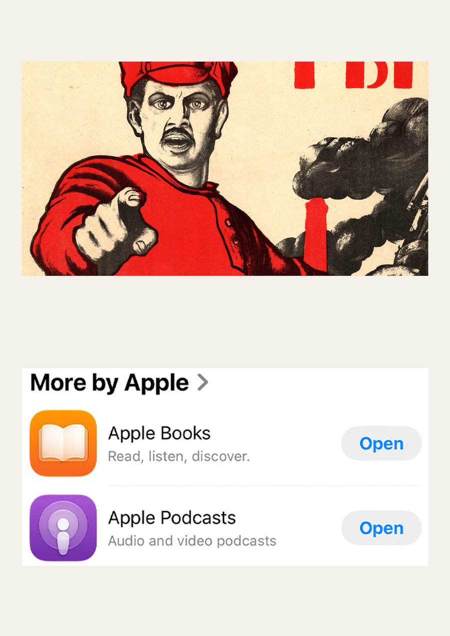
D. Moore. «Are you signed up as a volunteer? , ” 1920. Fragment [I01] Apple. App Store. Fragment of official reference illustration; observation 03.11.2026 [I04].
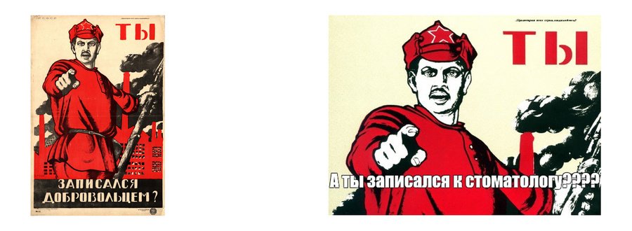
Left: D. Moore. «Did You Sign Up as a Volunteer?» 1920 [I01]. Right: Meme version of a dentist. Author and creation date are unknown; observation 11/03/2026 [I02].
The selection of the visual research topic stems from a desire to understand how familiar poster techniques change their function in the digital environment. I was particularly intrigued by the meme versions of Dmitri Moore’s posters: the pointing gesture remains, but the military call-to-arms transforms into a reminder of everyday life.I am interested in exploring this persistence of form when the message shifts. Such a comparison helps the viewer read the images they encounter in applications and online correspondence more closely.
Left: A. Rodchenko, V. Mayakovsky. Advertising for Mosselprom butter, 1923 [I06]. Center: A. Rodchenko. «1919 in Soviet History, ” plate 20, circa 1926 [I18]. Right: Apple. Utilities folder. Official illustration; observation 11/04/2026 [I22].
Material and Scope of the Study
For this study, samples of Soviet poster art from the 1920s and 1929 were selected, including agitational, educational, and advertising works. The historical section features pieces by Dmitry Moor, Alexander Rodchenko, El Lissitzky, and Alexey Radakov, as well as Gustav Klutsis’s montage compositions.To facilitate comparison, we utilized distinct Apple interfaces and published memes. Selection criteria included the prominence of the technique under investigation, the ability to compare its function, and the availability of the image source. November 2026 marks the observation period for digital materials.Key question: how does the poster’s appeal shift when the viewer becomes an interface user or a meme creator?
Working hypothesis: individual poster techniques retain a recognizable form but take on a different function. In an interface, visual emphasis is tied to an available action, whereas in a meme, a familiar image allows for the substitution of a message.
The study tests this assumption on specific juxtapositions. A claim regarding historical influence requires further evidence.
Left: D. Moore. «Did You Sign Up as a Volunteer?», 1920[I01]. Center: Meme about a dentist. Author and date are undetermined [I02]. Right: Meme about a leadership course. Author and date are undetermined [I03].
One Poster Becomes Different Messages
The figure, gaze, and pointing gesture remain recognizable. Replacing the text shifts the address from a military context to a mundane or academic one.Research Outline
- Introduction (interest, body, question, method, and sources)
- Large Word (text scale and highlighting the main point)
- Gesture and Direction (recipient of address and direction of action)
- Photomontage and Scale (comparison of fragments and new context)
- Module and Repetition (grouping and order of elements)
- Image and Caption (changing meaning through new text)
- Conclusions on Comparisons (reuse, analogy, action)
- Conclusion (answering the question and defining the result’s scope)
- Sources and Bibliography (image catalog and bibliography)Each section of the study focuses on one method of constructing visual address: large word, gesture and direction, photomontage and scale, module and repetition, and image and caption. A typological structure was chosen. This allows for the comparison of similar techniques across different media. The analysis proceeds from the whole image to the detail, then to a digital example, and finally to a conclusion about the technique’s function. The date, purpose, and recipient of each object are considered separately.
Left: A. Rodchenko. «Lengiz. Books for All Fields of Knowledge, ” 1924–1925, according to the museum catalog in Lyon [I05]. Center: A fragment of the same „Books“ poster [I05]. Left: Apple. The application bar with the Open command [I04].
From Word to Action
In «Lengize, ” the word „BOOKS“ is incorporated into the voice imagery. In the App Store listing, the word „Open“ signifies an available action. The similarity in visual emphasis does not yet explain its function. Let’s start with a question: how do the size, shape, and position of a word change the way it is read?BIG WORD
Масштаб текста и выделение главного
Left: A. Rodchenko. Advertising poster «Good Years, ” 1923. Lithograph MoMA, #624.2018 [I07]. Right: A. Rodchenko. „Good Years, ” 1923. Title fragment. MoMA [I07].
Left: A. Rodchenko. «Lengiz, ” 1924–1925. Fragment. Museum of Printing and Graphic Communication, Lyon [I05]. Right: A. Rodchenko. „Dobrolet, ” 1923. Title fragment. MoMA [I07].
A Large Word Highlights the Main Idea
Text Hierarchy in AdvertisingIn the «Dobrolet» poster, the title is set in a larger font size than the neighboring lines and highlighted with a red outline. The call to buy shares is placed at the top, while the subscription terms and address are at the bottom.The poster suggests different levels of reading: the title can stand out from the other lines, whereas the details require closer inspection. This is an observation about composition. The visual path of the viewer’s eye is not measured here.Large Letters, Different Forms
Two Ways to Make a Word Part of the CompositionIn «Lengize, ” the letters of the word „BOOKS“ enlarge in sync with the expanding form around the face. In „Dobrolet, ” the title occupies a stable horizontal line.A large word can depict an amplification of voice or solidify an organization’s name. Its function depends on its relationship with the other elements of the page.Left: Apple. Detail from the Apple Store illustration [I04]. Right: A detail from the same illustration: the section heading and an app listing. The scale has been enlarged only for analysis [I04].
A Button Doesn’t Need Billboard Sizing
In an interface, significance is also indicated by color and placement In this App Store snippet, the «More by Apple» heading is larger than the «Open» text. However, the action is associated with the small area to the right of the app name.The word «Open» is emphasized by its blue color, the button’s background, and its repeated placement. Tapping initiates the system action. Therefore, the scale of the text cannot be directly equated with its functional importance.Left: User version of the scenario. Author and creation date are not set. Meme arsenal, No. 1970424 [I09]. Right: D. Moor. «Did you sign up as a volunteer?», 1920. Excerpt from the original prompt [I01].
New Caption Shifts the Address
The meme utilizes a recognizable figure as a ready-made phrase.In the user variation of the Moor poster, the word «YOU» remains in its original position. The added white letters with black outlines pose a new question about the scenario.
Here, both the content and the typography change. The new caption intersects the figure, and the original military call to action vanishes. The image transforms into a reminder that can be directed toward an acquaintance.
Left: Fragment of the «Dobrolet» advertisement, 1923 [I07]. Center: App Store application listing [I04]. Right: Meme about a scenario. Author and creation date are unverified [I09].
The highlighted word changes the function
Interim ConclusionIn the examples reviewed, the word highlights a title, designates an available action, or alters the reason for contact. The work with accents is preserved, but the viewer’s role differs.The reworking of the poster into a meme is evident in the repetition of a specific image. A compositional analogy has been established for the interface. Direct borrowing from the poster through this comparison has not been proven.GESTURE AND DIRECTION
Адресат обращения и направление действия
Left: D. Moor. «Did You Sign Up as a Volunteer?», 1920. Hand fragment [I01]. Right: El Lissitzky. «Red Wedge on White», 1920. Museum of Fine Arts, Boston [I08].
The Second Tool: Directionality
The Human Gesture and the Geometric VectorIn Moor’s work, a finger projects from the plane of the sheet toward the viewer. In Lisitsky’s work, the red wedge operates within the composition, entering the white circle. Both solutions establish direction, but they define the recipient’s position differently. In the first case, the piece addresses the viewer personally. In the second, the viewer observes a symbolic collision.Left: El Lissitzky. «Red Wedge,» 1920. Color lithograph. Museum of Fine Arts, Boston, No. 2000. 1069 [I08]. Right: A fragment of the same sheet: the point of the wedge, a white circle, and the word «BEAT.» The proportions and colors remain unchanged.
The wedge has a specific objective
Geometry retains political meaningA red triangle is contained within a white circle. The inscription «BAY» clarifies the nature of this movement. The red and white relate to the opposing forces of the Civil War. The form participates in the agitational statement. If compared to a digital arrow, one must compare the purpose of the direction while preserving the original context of the poster.Left: D. Moor, 1920. Fragment of an indicating gesture [I01]. Center: touching and swiping icons from the iPhone guide [I11, I12]. Right: Apple. App Store illustration [I04]. View as of 03.11.2026.