Communication theory: matrёshka
Introduction

Brand logo featuring the iconic matryoshka silhouette
This project asks: can a centuries-old symbol speak a completely different language? The matryoshka carries dense cultural baggage—souvenir shops, folklore, predictable patterns. But what if we treated it not as an object, but as a sign within a communication system? To do that, we do not only «make it pretty»: we redesign the whole system of signs around it — material, colour, composition, context, visual language of the boutique and the website.
The course defines communication as a systemic process of generating meaning through symbols and signs, always embedded in a particular cultural context. In this sense, a brand is also a small communication system: it produces symbolic messages, audiences decode them, and together we negotiate what this object «means». The project matrёshka was our attempt to apply this understanding of communication theory directly to visual identity and to see how theoretical «lenses» can help design decisions feel more conscious and less intuitive.
In contemporary design, every decision is a communicative act. Color signals luxury or accessibility. Packaging creates anticipation. Spatial design frames the encounter between viewer and object. By treating the matryoshka as a text to be rewritten, we demonstrate what design does best—creating new meanings through form.
Presentation for general audience
matrёshka — collectible porcelain nesting dolls, created as art objects for contemporary interiors. They feature a familiar silhouette, but with porcelain, deep shades, and a glossy finish that invites you to take a closer look.
Core collection: minimalist porcelain matryoshkas in red, white, and blue
We retain the classic form, but change the language in which it speaks: pure blocks of color, porcelain instead of wood, neat gold accents.
The tradition remains, but the folkloric «heaviness» disappears. The matryoshka begins to behave like a modern object that can easily be imagined in any interior, from a Scandinavian living room to a city loft.
Premium packaging design — structured cardboard with nesting-inspired cutout and wooden display base
The matryoshka packaging is the first scene. Thick cardboard, cut to shape, soft bedding, logo and collection name, typeset calmly and confidently.
You want to put the box next to you, not immediately throw it away: it continues the feeling of a neat, collected object.
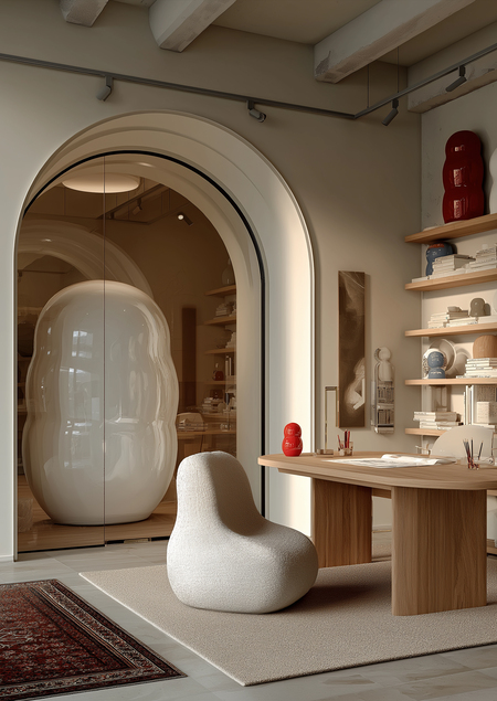
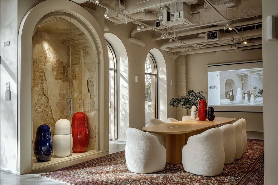
Boutique interior with curated display of porcelain pieces
The matrёshka boutique is designed like a small porcelain gallery. A bright space, low podiums, few objects, lots of air. You don’t «take goods off the shelf»; you choose an exhibit for yourself. And then this exhibit quietly moves to your shelf — and continues to feel at home there.
matrёshka is about things that don’t get lost in the interior, but set the mood.
A tradition that doesn’t hold back, but catches up with modern design.
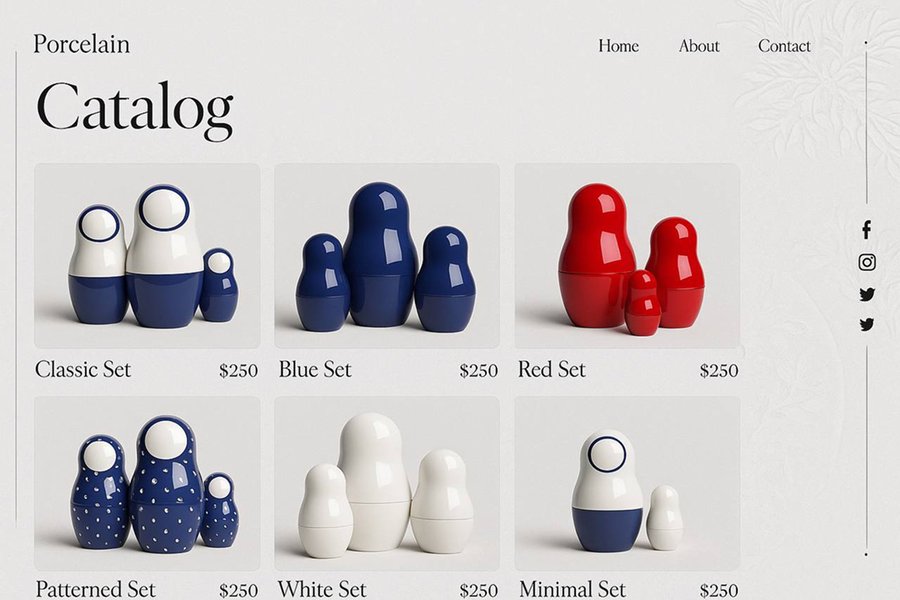
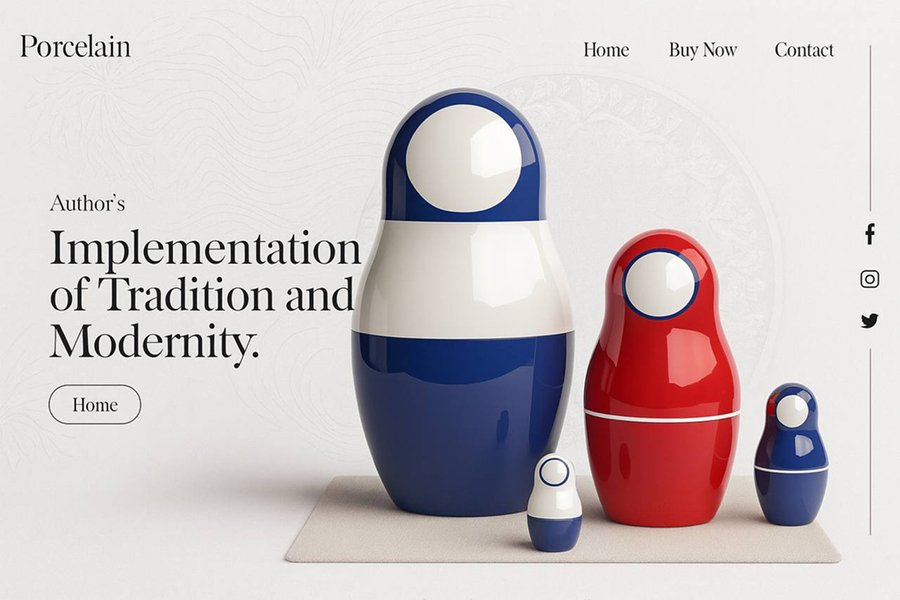
Website on desktop
If you can’t make it to the boutique, the matrёshka website serves as an online gallery, featuring large photos, details, and stories about the collections. In just a couple of minutes, you’ll know which figure is «yours» and have a pretty good idea of where it will stand in your home.
Two promotional posters
Presentation for professional audience
matrёshka is a brand of porcelain nesting dolls that deliberately takes this familiar symbol from the souvenir shelf and places it in the realm of curated objects. We work at the intersection of art objects and premium interior decor, and we start by thinking about how the matryoshka will look in a gallery display case, on a concept store shelf, or in a hotel interior.
Large matryoshka set
FROM SOUVENIR TO CURATED OBJECT.
For us, the matryoshka doll is primarily a code, not just a form. The silhouette, the idea of «nesting», associations with home and heritage are already embedded in the viewer’s perception. We do not break this code, but rather reconfigure it: instead of wood, we use porcelain; instead of overloaded painting, we use clean spots of color and neat gold accents. The same symbol begins to be read as a contemporary object, while remaining recognizable. In essence, this is a very applied semiotic approach: we work with a ready-made symbol, changing the context, material, and language around it.
Packaging detail with matryoshka inside
The brand’s product logic is simple and convenient for partners. There is a stable core — permanent collections that can form the basis of the assortment. Seasonal releases appear around it, creating opportunities to update storefronts and communications. On top of that, we can put together exclusive series for a specific venue: customize the palette, details, and packaging to match the visual language of a gallery, hotel, or store. Within one strong symbol, we have several levels of offerings — from a «quiet» permanent presence to high-profile collaborations.
DESIGNED TO BE DISPLAYED.
Matrёshka was originally designed as an object that works well in space. We think about how the figure is perceived from a distance in a display case and at arm’s length, how it behaves alone and in a group. Thanks to their shape and proportions, it is easy to assemble small compositions that look like a deliberate choice by a curator, rather than «just something else on the shelf.» Along with the objects, we provide our partners with clear scenarios: how to assemble an island, how to illuminate porcelain and gold so that they work rather than dazzle.
Office space with matryoshka as a statement piece
The brand’s visual system extends from packaging to the office. Boxes, tags, presentation graphics, boutique and workspace design—everything follows the same logic: minimal noise, clean background, focus on the object. For a professional audience, this is an important marker: behind the object is not chaotic «art for art’s sake, ” but a cohesive brand with a clear language and discipline.
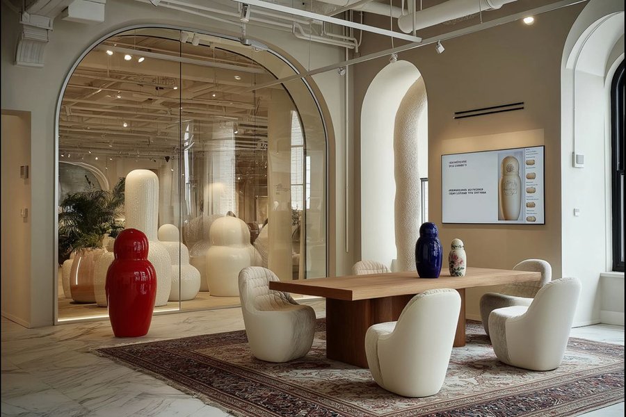
Consultation area
CONSISTENCY IS A FORM OF TRUST.
Workshop interiors
Production is tied to our own workshop with small runs and a clear batch structure. It is a lively, manual process, but within a controlled framework: there is accounting for series and releases, predictable deadlines, and established quality control stages. For galleries and shops, this means that matryoshka is not a one-off experiment, but a partner with whom you can plan: form an assortment, assemble display cases, work with collectors.
At the level of communication theory, we rely on a simple idea: a matrёshka is a language, not just an object. Its shape, scale, color, shine, and the context in which it appears are all elements of a message that your visitor reads. Through this language, the matryoshka organically fits into different stories — from «a modern interpretation of tradition» to «a subtle artistic accent in the interior.» Your space gets not only a beautiful object, but also a ready-made visual code that already knows how to speak to the audience.
Consistency is a form of luxury. When the visual code doesn’t fall apart, it’s easier to trust the brand.
Theory in action: How the course shaped our decisions
The course helped us stop thinking about the matryoshka as a «nice object» and start treating it as a sign inside a communication system.
Semiotic recoding became our tool. We took the existing symbol and consciously changed the code: material (porcelain instead of wood), visual language (clean color fields and gold instead of dense patterns), context (boutique as gallery, not souvenir shop). These weren’t style choices—they were instruments for recoding meaning: from cheap souvenir to collectible art object.
The socio-cultural approach taught us to look beyond form to the practices around it. For general audiences, we speak about home, rituals, gifts, and the matryoshka’s place in interiors. For professional audiences—about positioning, editions, display scenarios, and partnership formats.
Essentially, we applied theory this way: first we chose our lenses (semiotic + socio-cultural), then checked every visual and textual decision by asking: what will this «say» and how will it change the way people live with this object?
The course gave us vocabulary to justify design choices. When we developed nesting-structure packaging or workshop photography with unfinished pieces, we weren’t just «making it look good"—we were reinforcing metaphors, building authenticity through transparency, creating narrative from production to purchase. We didn’t just redesign a matryoshka—we designed a new communication system around Russian craft heritage.
Description of the application of the generative model
In this work, Midjourney https://www.midjourney.com/imagine and Ideogram https://ideogram.ai were used exclusively for image generation. The generative model ChatGPT 5.1 https://chatgpt.com/g/g-ZPlw6rlsN-gpt-5-1?locale=ru-RU was also used in the project to refine the ideas presented.
All data is based on real sources — our course, as well as our own conclusions drawn after completing the online course.
The project is based on materials from the Communication Theory course.
Most of the images are taken from Zlata Russkikh’s project https://hsedesign.ru/project/e7ec67ecc45845bda0402b21d8cc2eef
Images from Zlata Russkikh’s project, created using Ideogram AI https://ideogram.ai
Additional images generated using Midjourney AI https://www.midjourney.com/imagine


