
Communication theory: Just between us

This project explores how communication theory transforms design from a «beautiful form» into a controlled system of meaning.
We approach the brand as a message: it has a sender, a channel, a receiver, a context, and inevitable noise — and it is the designer who determines what will be heard and what will be lost along the way.
Communication in design cannot be reduced to the transmission of information from sender to receiver. Unlike classical linear models, design more often operates within an interpretive field, where meaning is not predefined but emerges through interaction with the object. Design objects act as mediators of communication: they construct context, set the tone, and regulate the distance between participants in interaction.

Brand identity elements
In this sense, design does not «speak» but invites interpretation, creating conditions for dialogue — between people, between an individual and an object, and between the personal and the social. Communication theory allows us to view design as a system of signs, social practices, and interpersonal interactions: the semiotic approach enables the analysis of visual elements as signs, the sociocultural approach frames them as part of everyday rituals, and interpersonal theory functions as a tool for managing closeness, trust, and identity.
Additionally, we rely on key elements of communication — encoding, channel, decoding, context, and noise — in order to design not an image, but a trajectory of meaning interpretation.
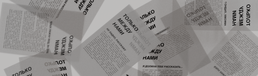
Postcards for chocolate bars
In contemporary design, this model becomes bidirectional: the audience not only receives messages but also responds through reactions, discussions, and choices, and the brand incorporates this feedback when developing its visual system. The online course in communication theory served as the foundation for this framework and for structuring different modes of presentation — for a general audience and for professionals.
Postcards for chocolate bars
As a case study, we developed a fictional chocolate brand titled «Just Between Us.»
This product is not simply about taste, but about a situation: a private conversation, trust, light irony, and the desire to stay a little longer. «Just Between Us» is chocolate for quiet conversations that are not meant to be spoken aloud — not for display and not for special occasions, but for moments of closeness and informal communication.
White chocolate packaging
It becomes a social pretext — a small permission for openness, an invitation to linger, to stay longer, and to share something personal. The brand does not impose rules or demand explanations; it creates an atmosphere in which conversation can emerge naturally.
Chocolate packaging system
The slogan captures this tone: «I will tell you, but this is just between us.» Visually, the brand is built on contrast: externally it is restrained and almost unnoticeable, without excessive details or visual noise; internally it is warm, rich, and emotional, like a conversation that begins with a smile and unexpectedly becomes personal.
Large negative spaces, strict typography, and minimal accents function as a «silent mode»: they reduce visual noise and allow the text to resonate. The target audience is united not by age or status, but by a shared need for confidential dialogue — friends over coffee, colleagues in semi-formal meetings, and individuals engaged in one-on-one conversations.
From a professional perspective, «Just Between Us» functions as a communication system in which the product acts as a mediator. The project’s communication mechanics unfold through two presentation trajectories: for a general audience, emotional recognition is primary (close distance, whispering, coffee, a brief phrase that invites into a small secret), while for professionals, the same material is reorganized into an analytical structure — target audience, insight, values, brand character, differentiation from competitors, and visual system justification.
Brand platform
Design operates here not through explicit promises but through visual signals: minimalism reduces noise, increases signal clarity, and keeps the brand within the realm of voluntary attention. The visual language is based on principles of understatement and intimacy — muted colors, soft contrasts, and gestures associated with whispering, anticipation, and closeness.
The layering of images and text imitates the structure of real conversation, in which meanings overlap and are not always immediately legible. Packaging becomes a boundary between the public and the private: the minimalist design does not «shout» but invites, and opening the package turns into an act of access — analogous to consent to engage in dialogue.
Brand graphic elements
Brand color palette
Thus, the brand employs design not for direct message transmission, but to manage communication context and social distance. Within the framework of Message Design Logics, expressive logic establishes aesthetic intimacy and a tone of secrecy, conventional logic aligns with category expectations (quality, cleanliness, edibility), and rhetorical logic adapts the brand to user scenarios — creating reasons to gather, maintain contact, and encourage staying longer.
Brand graphic elements
Target audience
The theoretical foundation of the project is based on the interpretive paradigm of communication, according to which meaning is not transmitted directly but constructed by participants in interaction.
The brand’s visual elements function as signs without fixed meaning; viewers complete interpretation through their own cultural experience, personal memory, and social context.
Two layers are particularly significant. The first consists of cultural codes and symbols: the gesture of whispering, motifs of confidential dialogue, and associations with «only for insiders.» These elements are decoded instantly and function as a fast channel for meaning transmission.
Advertising poster
The second layer involves noise management. Language and composition are intentionally simplified so that viewers do not «decode» the design instead of perceiving the message. Within the encoding–channel–decoding model, meaning is encoded through typography, composition, imagery, and textual rhythm; the channel is represented by various presentation formats and media; decoding differs by audience — from emotional recognition to analytical interpretation.
The project also highlights the phatic function of communication: chocolate is not the primary message but maintains contact between interlocutors, becoming a pretext for interaction rather than its topic. Through interpersonal communication, the brand manages social distance, reduces formality, and fosters a sense of safety and trust.
The sociocultural approach is expressed through the normalization of «unproductive» communication — conversations, gossip, and the exchange of impressions — as a meaningful part of social life and everyday ritual. The online communication theory course formed the basis for selecting these perspectives and applying them to the brand’s design; theory here functions not as an add-on, but as a tool that determines how the system looks, sounds, and is interpreted.
Мордвинова М., Соловьёва О. Communication Theory: Bridging Academia and Practice: онлайн-курс. — Электрон. дан. — 2025. — URL: https://elearning.hse.ru/moocs/communication-theory-academia-practice/ — (дата обращения: 08.12.2025)
Ганган О. HSE Portfolio. Проект № 259729: электрон. дан. — 2025. — URL: https://portfolio.hse.ru/Project/259729 — (дата обращения: 12.12.2025).


