Communication Strategy for «Pillz»
COMMUNICATION THEORY IN THE FIELD OF DESIGN
To position our project within the academic tradition of this course, we must first establish a fundamental premise: design and contemporary art are not merely acts of creation, but profound acts of communication. They are participants in a continuous process of meaning-making. Communication theory provides the essential lens to understand this process, moving us beyond aesthetics into the realm of systemic interaction, interpretation, and cultural dialogue.
At its core, communication theory challenges the sender-receiver model. Communication is a relational and systemic process, where meaning is not transmitted, but co-created through the interaction of symbols, contexts, and interpreters.
This aligns with the interpretive and socio-cultural traditions of communication theory. An object’s meaning is not fixed within its form; it is generated through the viewer’s or user’s encounter with it. The context — be it a gallery, a digital platform, a retail environment, or urban space — acts as a crucial frame, shaping how the work is perceived. Furthermore, design and art operate within systems of signification (the semiotic tradition), where colors, shapes, materials, and compositions function as signs that refer to broader cultural codes, ideologies, and social narratives.
The narrative paradigm further illuminates this. Both designers and artists are, in essence, storytellers. They construct visual and experiential narratives that invite the audience to fill in gaps, draw on personal experience, and evaluate the story’s coherence to their own worldview. A successful piece, therefore, invites a dialogue that resonates with the audience’s values and experiences.
Moreover, media ecology reminds us that the medium is the message. The chosen material, scale, and technological interface of a work fundamentally shape the content and the nature of the communicative experience. Each medium creates its own rules of engagement.
Finally, this process is inherently rhetorical. Design and art are persuasive; they seek to influence perception, evoke emotion, challenge assumptions, or advocate for a way of seeing the world. Whether convincing a user of a product’s utility or provoking a societal critique, the work is engaged in an act of deliberate influence.
Therefore, to analyze or practice design and contemporary art without this communicative framework is to overlook its vital social function.
It is from this theoretical foundation that we now introduce «Pillz»: a distinctive brand of compact energy drinks in the form of water-soluble tablets. In the following sections, we will dissect how the theories briefly outlined here manifest concretely in Pillz’s identity and strategy.
PRESENTATION FOR A GENERAL AUDIENCE
What if your next energy drink came not from a can or a bottle, but from a tiny fizzing tablet?
Meet Pillz, a tablet that transforms a simple glass of water or soda into a burst of revitalizing energy. Picture this: it’s mid-afternoon and you’re hitting that familiar slump. Instead of reaching for a sugar-loaded canned drink, you drop a Pillz tablet into your water bottle and watch it dissolve with a satisfying fizz, releasing vitamins, caffeine, and a refreshing flavor.
In seconds, you have a delicious energy boost — no heavy cans, no extra sugar, no clutter — truly energy on demand designed to fit in your pocket and fuel your day whenever you need it.
But PILLZ is more than just a new way to caffeinate.
Our mission is simple: to empower busy people with convenient, clean energy while reducing the waste and hassle of traditional drinks.
The target audience is anyone with an active, on-the-go lifestyle:
- Students pushing through study sessions
- People who struggle keeping up with tons of work
- Athletes and adventurers who need a portable boost
All in all, Pillz made for people who value convenience and innovation.
Our core values blend
- Innovation (we love reimagining the status quo)
- Convenience (one small package contains several dozen servings of the drink)
- Sustainability (no more single-use cans or plastic bottles piling up).
We believe an energy boost should feel good in every sense — good for you and kinder to the planet.
PRESENTATION FOR A PROFESSIONAL AUDIENCE
Using Robert Craig’s theory of communication traditions, Pillz is fundamentally anchored in the semiotic tradition, treating its design as a complex, coded system of signs.
Also philosophy of Pillz relies on a sociocultural approach, placing the product within the context of specific social practices: late-night gaming sessions, cramming for deadlines, parties, workouts. The design and communication speak the language of these practices.
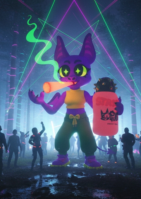
Mascot
The purple bat is a sign referencing nightlife, and energy. It is intentionally cartoonishly stylized with sharp lines and exaggerated features to resonate visually and culturally with the target audience of Gen Z and young adults.
Palette
The bright, neon palette — built on purple, electric pink, neon green and yellow — and holographic elements are direct indices of the digital era and glitch aesthetics. They intentionally reject naturalistic, muted, or pastel tones, signaling a deliberate departure from organic associations. Instead, this hyper-saturated, almost synthetic color scheme visually communicates the product’s core purpose: artificial enhancement, amplified energy, and instant stimulation. The «acidic» brightness doesn’t just attract attention — it performs the brand’s promise, making the effect of the product visually tangible before it’s even consumed.
The communication strategy for Pillz is built on Aristotle’s rhetorical framework of Ethos, Pathos, and Logos.
Ethos (Credibility & Authority):
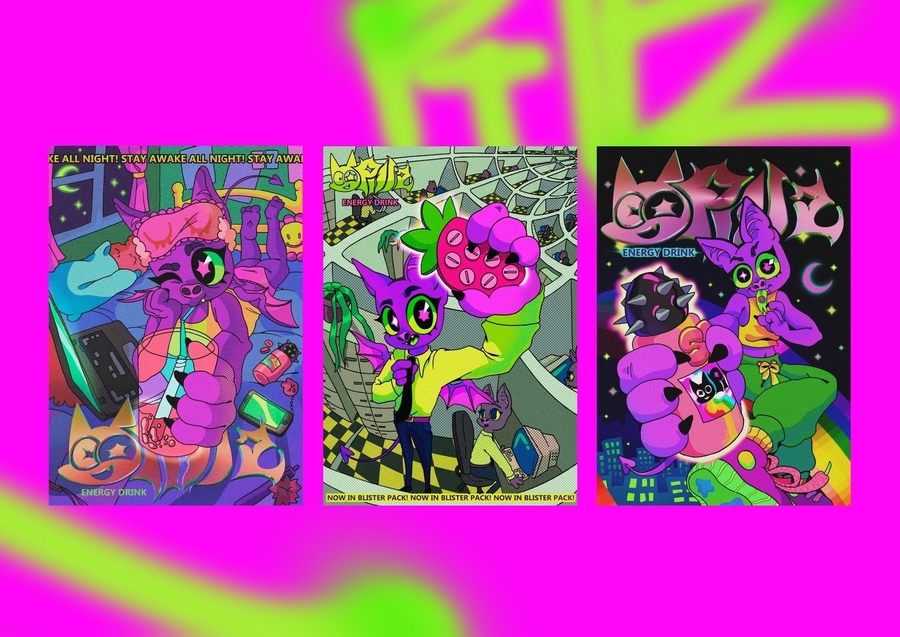
Futuristic, gamified language — holographic finishes and sharp graphics signal innovation and intentionality, positioning Pillz not as a mere beverage, but as a product of forward-thinking design. Subcultural authenticity — the use of cyberpunk, gaming, and nightlife visual codes demonstrates deep cultural insight, building trust with an audience that values niche recognition over mainstream appeal.
Pathos (Emotional & Sensory Engagement):
Mascot as emotional anchor — the purple bat embodies rebellion, night energy, and playful darkness, creating an iconic, almost tribal symbol for a community that identifies with «nighttime» living. Hyper-saturated visual assault — neon purple, pink, green aren’t just colors; they’re sensory triggers. They communicate intensity, artificiality, and enhanced reality — visually mirroring the «kick» the product promises. This aesthetic is designed to be irresistibly eye-catching.
Logos (Rational Justification):
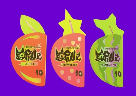
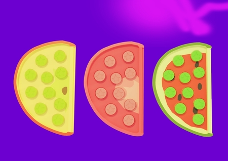
Clear functional benefit — the product is portable, compact, and space-efficient, occupying significantly less physical and visual space than traditional canned or bottled energy drinks. The product solves a practical problem (convenience) while adding a layer of experiential value (the ritual of consuming). Strategic flavor system — fruit icons communicate taste clearly and quickly, leveraging familiar sensory cues while staying within the futuristic aesthetic. Pricing and accessibility — positioned as a premium, design-forward product with a clear value proposition: not just caffeine, but an experience, a statement, and a ticket into a curated aesthetic world.
COMMUNICATION THEORY AS A BASIS FOR THE PRESENTATIONS
For a product like Pillz, communication is shaped not only by content but by form. Instead of technical descriptions or marketing clichés, the presentation relies on a clear, accessible narrative. This approach is grounded in communication theory, which defines communication as a process of encoding and decoding messages within a specific context. The Pillz narrative is deliberately structured to ensure clarity at the stage of encoding, while also accounting for different situations in which the message may be received. This allows the message to remain consistent and understandable across contexts.
The presentation strategy draws on established models from communication theory, including Robert Craig’s classification of communication traditions. Several of these traditions inform how the brand message is constructed and presented.
Generated with NanoBanana AI
One of the key frameworks used is the socio-psychological tradition, which focuses on how communication influences perception and interpretation. Within this framework, message framing plays an important role. Rather than emphasizing the avoidance of negative states such as fatigue, the communication highlights positive outcomes and functional benefits. This framing is based on the assumption that positively structured messages are more likely to be perceived as clear, constructive, and motivating.
Generated with NanoBanana AI
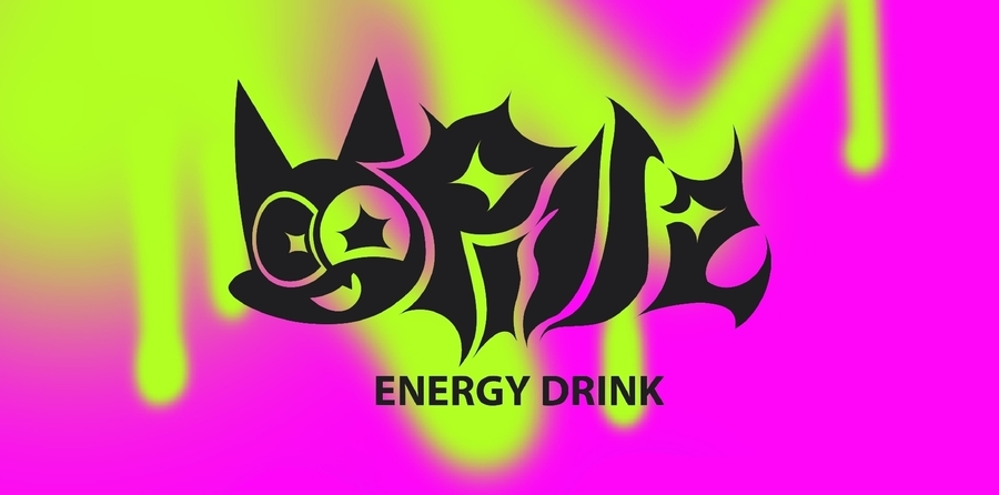
The semiotic tradition also informs the brand’s communication. From this perspective, meaning is conveyed through signs and symbols as much as through explicit explanations. The brand name Pillz, its visual identity, and the imagery of a dissolving pill function as symbolic elements that communicate energy, simplicity, and functionality. These visual and linguistic signs allow the core idea of the product to be understood quickly, without extensive verbal explanation.
Overall, the communication strategy for Pillz demonstrates how theoretical models of communication can be applied to brand presentation. By integrating framing, symbolism and context awareness, the brand narrative remains coherent, transparent, and aligned with its functional purpose, presenting the product as an energy solution shaped by both design and communication theory.
Generated with NanoBanana AI
Communication Theory: Bridging Academia and Practice // Smart LMS HSE URL: https://edu.hse.ru/course/view.php?id=133853 (дата обращения: 12.12.2025)
Robert T. Craig. (1999). Communication Theory as a Field. (дата обращения: 12.12.2025)
Barbara J. O’Keefe. (1988). The Logic of Message Design: Individual Differences in Reasoning about Communication. (дата обращения: 12.12.2025)
«Pillz» by Marina Klimova // HSE UNIVERSITY ART AND DESIGN URL: https://portfolio.hse.ru/Project/179612
Generated images (nanobanana.org)


