Gamma Soft Drinks
About the project
Brand of drinks whose tastes are based on aromas, due to which people will be able to predict which taste will be closer to them.
The product is based on the idea of smell as the basis for taste selection. As a result, the buyer learns a lot of drinks based on smells. A person can look at the composition (or notes) and understand which drink will be closest to him.

1. How communication theory works in the field of design
Brand communication goes beyond visual appeal and focuses on shaping meaning and emotional impact. Communication theory suggests that every design component — from logos to colors and forms — functions as a message, forming a visual language that engages the viewer’s feelings and interpretations.
Throughout the theoretical part of the course, the key idea that emerged was the importance of a narrative visual strategy in design communication. Initially, communication appeared to function mainly as the transmission of information. However, the course materials demonstrated that communication is fundamentally about constructing meaning and telling a story rather than simply delivering facts. The sender does not merely inform the receiver but creates a coherent world through visual and verbal symbols, which the audience interprets based on their own sensory experience and cultural background.
This understanding became central to the concept of Gamma, a soft drink brand built around aroma as the primary guide to taste selection. In this project, communication is not limited to describing flavor characteristics; instead, it forms a narrative in which smell becomes the starting point of perception. By presenting drinks through aromatic notes, Gamma invites the viewer to imagine taste before consuming the product, turning packaging into a storytelling medium rather than a purely informational object.
Applied to design practice, this approach highlights that a package is never «just an image.» Every visual element — typography, composition, labeling structure, and absence of literal ingredients — acts as a sign within a larger communicative system. Here, the semiotic perspective becomes especially important: Gamma does not directly depict fruits or flavor additives but refers to them indirectly, allowing meaning to emerge through association and memory. Smell, as an invisible yet powerful sense, is translated into visual language, reinforcing the idea that design works through interpretation rather than direct representation.
2. Presentation of your brand for a general audience
Gamma is a non-alcoholic drink brand that helps people choose beverages through aroma. Instead of relying on familiar flavor names, Gamma offers drinks built around scent profiles, allowing consumers to intuitively predict which taste will suit them best. Our idea is to make the process of choosing a drink more personal and sensory, turning smell into the key guide for taste. Gamma invites people to explore flavor not as a fixed label, but as an experience formed in the imagination even before the first sip.
Target audience
1. Young people aged 20–40; 2. Consumers who regularly choose non-alcoholic drinks; 3. People interested in sensory experiences, discovery, and self-expression; 4. An audience open to new formats and unconventional ways of interacting with products.
From the perspective of communication theory, the audience is understood as an essential part of the communicative context. The meanings created by Gamma emerge through the interaction between the brand’s visual and verbal language and the viewer’s personal sensory experience, habits, and cultural references.
Brand message
Main slogan: «Choose by smell»Supporting slogan: «Taste begins before the sip»
Through these messages we: • Apply the narrative paradigm, telling a story in which aroma becomes the starting point of taste perception; • Shift attention from direct information to anticipation and imagination, encouraging the audience to complete the story themselves; • Communicate values of individuality, curiosity, and mindful choice. • Rather than explaining the product in technical terms, Gamma builds a small narrative around sensory exploration, allowing consumers to experience the brand emotionally.
Brand values
Sensory awareness — emphasizing smell as an underestimated but powerful sense in everyday consumption. Personal choice — encouraging people to trust their own perceptions and preferences. Discovery — presenting each drink as an opportunity to explore new combinations and sensations. Everyday ritual — integrating Gamma into daily moments such as work breaks, meetings with friends, or quiet personal time.
From a sociocultural perspective, Gamma becomes part of modern lifestyle practices where consumption is not only functional but also reflective and experiential. The brand supports the idea of a «good life» built around attention to feelings, individuality, and sensory pleasure.
3. Presentation of your brand for a professional audience
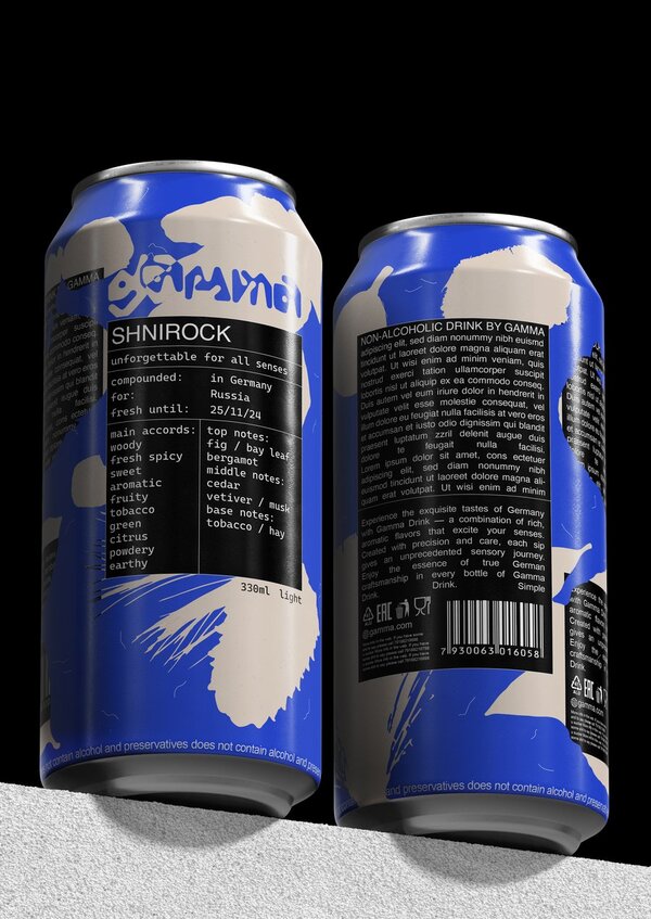
Visual identity — the visual identity of Gamma is constructed as a complete system where smell functions as the primary mediator between perception and taste. Unlike conventional soft drink branding, which relies on literal flavor imagery and immediate visual stimulation, Gamma translates the logic of perfumery culture into the non-alcoholic beverage segment. The brand positions taste as a consequence of aromatic expectation.
The visual system is based on perfume labels as a constant form, which changes depending on informational content.
This approach reframes the act of choosing a soft drink into a process of interpretation rather than impulse, aligning Gamma with audiences accustomed to fragrance, sensory analysis, and conscious consumption.
Typography — layout structure and compositional hierarchy remain stable, while color fields and graphic interventions vary across flavors. This creates a modular identity that mirrors the logic of perfumery catalogues, reinforcing consistency while supporting diversity within the product line.
Color — it operates as a sensory index. Saturated yet controlled tones correspond to aromatic intensity, while contrasting neutral elements maintain legibility and precision. Abstract black shapes of tastes are visual metaphors for exploring the taste of Gamma through smell — when the main component disappears, and only the taste sensation around it remains.
From a communicative standpoint, Gamma deliberately distances itself from the dominant category codes of the soft drink market. While competitors rely on bright palettes, fruit imagery, and playful characters, Gamma adopts a restrained, editorial aesthetic rooted in product information and sensory language. This positions the brand closer to niche fragrance brands than to mass-market beverages, increasing cultural capital within its target audience.
The brand appeals to people who are already fluent in the language of taste and aroma and who make their daily choices — from perfumes to soft drinks — as a manifestation of personal individuality. Rather than offering a fixed emotional message, Gamma provides a framework for self-selection, where meaning emerges through the user’s own sensory experience.
In this way, Gamma functions not merely as a beverage brand, but as a sensory interface — a system that teaches the consumer to read taste through smell, transforming consumption into an act of conscious interpretation rather than passive choice.
4. How we arrived at the strategy (linking theory and practice)
Choice of approach
We work within an interpretive communication logic. The goal of the project is not to measure immediate market performance, but to construct and interpret meanings embedded in cultural and sensory contexts. Gamma is developed as a system of meaningful messages that teaches the consumer to read taste through smell.
From the definition of communication to the brand
We rely on the definition of communication as a process of meaning creation through symbols, signs, and interaction within a specific context. Meaning is not transmitted directly, but emerges through interpretation based on the receiver’s prior experience.
Gamma is understood as a communication system, not a single message. This system includes packaging design, visual identity, and informational structures that collectively guide the consumer toward conscious taste selection.
For each communicative element, we define:
Sender: the Gamma brand as a curator of sensory experience.
Receiver: young adults aged 20–40 with developed sensory literacy and interest in non-alcoholic drinks.
Channel: primarily packaging and visual identity, supported by informational content.
Symbols and meanings: smell as the primary code for understanding taste; abstraction instead of literal flavor depiction.
Choosing Craig’s traditions
Out of Craig’s seven traditions of communication theory, the project consciously relies on four:Semiotic tradition Used to construct the visual language of Gamma. Color fields, typography, perfume-label layouts, and abstract graphic forms function as a system of signs that communicate aromatic intensity and taste perception without direct illustration.
Sociocultural tradition
Applied to analyze contemporary consumption practices. Gamma is embedded in a culture of conscious choice, sensory analysis, and everyday rituals (choosing drinks similarly to choosing fragrances), rather than impulsive consumption.Phenomenological tradition
Relevant to the focus on individual sensory experience. Taste is understood as subjective and personal, and communication is built around the user’s perception, memory, and interpretation of smell.Rhetorical / digital rhetoric tradition
Used to structure persuasive yet non-intrusive messages. Instead of emotional pressure, Gamma employs informational clarity and aesthetic restraint, encouraging self-selection rather than persuasion.Visual language stage
All visual elements are evaluated through a semiotic lens:Perfume labels act as a stable communicative structure.
Variable colors and abstract black forms signify aromatic intensity and taste sensation.
The absence of literal ingredients reinforces interpretation rather than direct recognition.
Critical review stage
The project is examined from a critical perspective:Does the brand avoid reinforcing mass-market overconsumption aesthetics?
Does it respect the consumer’s agency instead of manipulating desire? Gamma positions itself as an alternative to aggressive visual persuasion in the soft drink category.
Communication system stage
Gamma’s visual and informational elements are assembled into a coherent system where each message supports the idea of taste as an interpretable experience. The brand does not dictate meaning but creates conditions for conscious choice, aligning communication theory with design practice.Dainton, M., Zelley, E. Applying Communication Theory for Professional Life / M. Dainton, E. Zelley. — Thousand Oaks: Sage, 2015. Accessed 03.12.2025.
Craig R. T. Communication Theory as a Field // Communication Theory. 1999. Vol. 9, no. 2. P. 119–161.
Griffin, E. A First Look at Communication Theory / E. Griffin. — New York: McGraw-Hill, 2012. Accessed 03.12.2025.
Baudrillard J. For a Critique of the Political Economy of the Sign. St. Louis: Telos Press, 1981. 288 p.


