Communication theory: brand promotion of «Trails of the World»
GENERAL THEORETICAL PART
In product design, symbols play an important role. With colors, textures, proportions, and visual accents, the designer creates a certain emotional atmosphere and evokes specific associations. This relates to the semiotic approach, where an object functions as a sign that the user reads through their own cultural codes. For example, a rough surface may be associated with nature and reliability, while cold metal may suggest technology and precision. These associations are not accidental, they are an essential part of communication.
Another important aspect is narrativity. The Narrative Paradigm states that people understand the world through stories, and design becomes part of these stories. Even a simple object like a backpack or a thermos can fit into a user’s personal «journey»: a trip, a route, the weather, or memories. A designer can build such stories on purpose, adding elements that create a feeling of belonging or set the mood for travelling.
Symbolic Convergence Theory also plays a significant role in brand communication. It explains how shared symbols and images help people feel connected to a certain group. Brands create not just products but an atmosphere in visual world where a person can find part of their identity. For outdoor gear, this is especially important: to choose a brand, a person needs to feel a connection to its values: nature, freedom, routes, or the culture of a region. Symbols become a bridge between personal experience and the brand’s visual language.
Media ecology is also important because the medium is part of the message. The way a brand presents itself through its website, packaging, materials, or tone of voice is already a communicative action. For example, eco-friendly packaging sends a message about respect for nature even before the user reads anything.
Finally, communication theory helps us understand users better. The Uses and Gratifications approach reminds us that audiences actively choose products and media that satisfy their needs: informational, emotional, or social. In outdoor design, this means that people care not only about «weight, durability, and comfort, ” but also about emotional reasons for choosing equipment: the wish to feel part of a culture, the desire for freedom, or the need for inspiration.
In this way, communication theory lets us see design not as a set of formal solutions, but as a system of meanings, where every element of a product or visual identity participates in a dialogue. This is especially important for an outdoor brand: travelling is always connected to stories, emotions, culture, and personal experience. The aim of design is not only to make travelling comfortable, but also to help people feel part of a bigger path, of their own „trail of the world.“
PRESENTATION OF THE BRAND FOR A GENERAL AUDIENCE
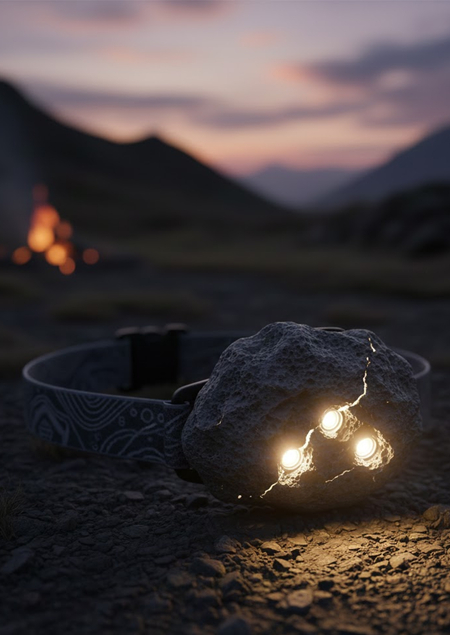
«Trails of the World» is an outdoor equipment brand created for people who go into nature not only for the route itself, but also for the feeling of connection to a place. We believe that a trip is not just travelling, it is a way to feel the history, culture, and character of a region. That is why each of our collections is dedicated to a specific part of the country, and the design of the equipment reflects its atmosphere.
We do not produce clothing or shoes, we produce only the items that accompany you during your journey: tents, backpacks, cookware, stoves, sleeping mats, water filters, lighting, trekking accessories, and winter equipment. All of this is practical, thoughtful, and reliable gear that helps you travel easier and safer.
But «Trails of the World» is more than just a set of objects. We want every trip to feel deeper. So that a backpack reminds you of the pine air of Karelia, and the shape of a lantern reminds you of the soft northern light. Materials, colors, and details carry the mood of the region, inspiring you to plan a new route or return to your memories.
ALTAI
This collection is inspired by the feeling of wide open spaces, height, and the ancient strength of Altai. It uses earthy colors, deep greens, and stone-grey tones that echo mountain ranges, steppes, and forests.
The forms are more geometric and sharp, reflecting the structure of mountain landscapes. Materials are dense and wind-resistant.
This collection is designed for routes where endurance, weather resistance, and confidence in the mountains are essential.
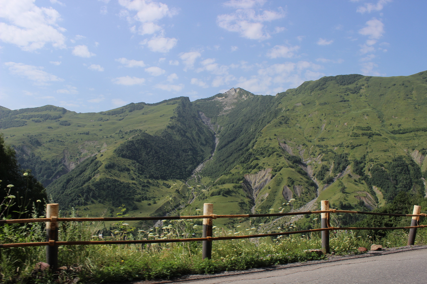
CAUCASUS
This collection is inspired by a region full of contrast and strong emotional energy. It includes warm ochre and reddish tones of mountain rocks and deep blue shades of the high-altitude sky.
The forms are more dynamic, with a focus on strength and resistance to heavy loads. Materials are made for difficult terrain, temperature changes, and active trekking.
This collection is for routes where practicality matters, but the energy of movement and the dramatic nature of the landscape are just as important.
KAMCHATKA
The most severe and raw collection of the brand. Its visuals are inspired by volcanoes, black basalt, fog, and the ocean wind.
The palette includes cold greys, volcanic black, and deep blues, with small bright accents inspired by lava or geothermal springs.
The forms are clean and minimalist, focusing on functionality in extreme conditions. Materials are highly water-resistant, temperature-resistant, and suitable for long journeys.
Kamchatka is a collection for those who choose routes where nature shows its true power.
We create equipment that does more than perform well, it helps you feel the place you are travelling to. Unlike large universal brands, we do not try to cover the whole world at once. We focus on specific regions and study their atmosphere, colors, materials, and natural features, so each item becomes part of the journey. This makes our approach more careful, meaningful, and human-centered.
We also design our equipment to last and to support you in different environments. We focus on durability, intuitive use, and comfort but we also respect the emotional side of travelling. «Trails of the World» is for those who choose not just equipment, but a path where both quality and a sense of connection with nature matter.
PRESENTATION OF THE BRAND FOR A PROFESSIONAL AUDIENCE
The brand «Trails of the World» sees outdoor equipment not only as a functional object, but also as an element of cultural communication. Each collection is based on research into regional identity: natural, visual, and emotional. This approach helps us design products that combine practicality with meaningful expression.
conceptual foundation
Our products are designed through two levels:
- utilitarian: reliability, ease of use, durability - symbolic: expressing the character of a region through form, color, materials, and details
The semiotic approach lets us view equipment as a system of signs. Colors, proportions, textures, and construction choices carry specific meanings. The user interprets these meanings through their own cultural associations, which makes communication more complex and open to interpretation.
We also rely on the principles of affordances: each construction element should intuitively show how it should be used. This is especially important outdoors, where people need simple and clear solutions that reduce setup time.
ALTAI
In the Altai collection, we use geometric and clear forms inspired by the structure of mountain ranges. The color system is based on earthy tones and cold greens, creating a feeling of stability and reliability.
Hardware is reinforced, materials are wind-resistant, and the internal organization of backpacks supports long mountain routes. Semiotically, the collection refers to the idea of «the strength of the place»: stability, calmness, and greatness.
CAUCASUS
This line has a more dynamic and contrasting visual character. Forms are more angular and reinforced, adapted to difficult terrain and heavy loads.
The palette includes warm ochre shades and deep blues. The central idea is the energy of movement, the dramatic landscape, and the feeling of climbing upward.
KAMCHATKA
The Kamchatka collection is the most technological. The design is minimalist, focusing on durability and functional clarity.
The palette is based on cold greys, volcanic black, and saturated blues, with rare bright accents.
Materials are extremely durable, water-resistant, and temperature-resistant, matching the severe climate of the region.
The concept is «raw nature» and stability in extreme conditions.
Design solutions and communication practice
1. Visual identity as a system of signs
Each collection creates its own «code, ” readable through color, texture, graphics, and form. This supports symbolic consistency and allows users to recognize a collection even without a logo.
2. Materials as communication
Materials communicate not only strength but also the atmosphere of the region:
- matte textures: calm northern landscapes - rough surface: rocky paths of Altai and the Caucasus - deep dark tones: volcanic nature of Kamchatka
3. Intuitive use
We aim for all elements (locks, vents, straps) to be understandable without instructions, reducing cognitive load outdoors.
4. Modularity
Many elements can be combined: extra pockets for backpacks, different flysheet options for tents, foldable cookware compatible with stoves. This helps users adapt their gear to their route.
«Trails of the World» brings together functionality and cultural interpretation. We aim to create equipment that offers not only convenience but also emotional connection to nature.
In a professional context, the project demonstrates how communication theory helps build a design system where each object is both a tool and a carrier of meaning.
COMMUNICATION THEORY AS BASIS FOR THE PRESENTATION
Creating the «Trails of the World» brand and its two presentations (for general and professional audiences) we relied on several communication theories from the course. These theoretical approaches shaped both the concept of the brand and the visual and meaning-based decisions inside the collections.
Narrative Paradigm: story as a tool of communication
The central idea of the brand which is expressing the atmosphere of a specific region is directly connected to the narrative approach. According to this theory, people understand the world through stories, and even product design becomes part of the user’s personal story.
This is why each collection represents not only a set of objects but also a small regional narrative:
- Altai: strength and open space - Karelia: calmness and northern softness - Caucasus: energy and contrast - Kamchatka: raw nature and intensity
In the general audience presentation, this is shown through the emotional tone: we focus on feelings, not technical features.
Symbolic Convergence Theory: building a shared symbolic world
This theory explains how people unite around shared symbols and values. We used it to build the visual system of the brand: each collection has its own symbols (colors, forms, textures) creating a coherent image of the region.
This builds a unified symbolic world of travelling, where users can recognize the collection even without branding. It strengthens brand identity and helps users feel connected to the «community of travelers.»
Semiotic approach: objects as signs
Equipment in our project is seen not only as a functional object but also as a sign that carries meaning:
- earthy Altai tones: stability and nature - matte Karelia textures: mist and calmness - contrasting Caucasus colors: energy and movement - dark Kamchatka palette: volcanic power
Even surface textures become part of communication. In the professional presentation, this is explained directly, showing how forms and textures reflect regional character.
Uses & Gratifications: understanding different audiences
This theory helped us separate communication for two groups:
for the general audience:
We focus on emotional and practical needs: - comfort - safety - inspiration - love for nature
Therefore, the tone is warm and descriptive.
For the professional audience:
We focus on: - structure - functionality - design logic - durability - modularity
Here the tone is analytical and systematic.
Media Ecology: the medium is the message
This approach helped us understand that the form of the presentation affects the message.
The general audience presentation uses emotional language and imagery: a «cool» medium that invites involvement.
The professional presentation uses a structured format: a «hot» medium focused on clarity and efficiency.
Thus we adapted the content to the context while keeping the core identity of the brand.
Affordances: intuitiveness as communication
This idea influenced our design decisions. We wanted every object to be clear and easy to use through its form alone:
- simple mechanisms - readable straps - clear interaction points - logical internal organization
In the professional presentation, this is explained, in the general one, it appears through tone and mood.
CONCLUSION
Communication theory helped us build the project as a complete system where:
- form and color carry meaning
- objects become part of a story
- different audiences receive different messages
- the brand forms its own symbolic world
- user experience is shaped by culture and emotion
Thus, theory became a practical tool for developing the «Trails of the World» brand and its design strategy.
Материалы курса «Communication Theory: Bridging Academia and Practice» // HSE URL: https://edu.hse.ru/course/view.php?id=133853 (дата обращения: 10.12.2025).
Личный архив Герасимовой Анастасии
Личный архив Батяшовой Екатерины


