Communication strategy: VOSTOK brand
Contents:
1. Reflection on the course material. Narrative visual strategy 2. Presentation of the VOSTOK brand for a broad audience 3. Presentation for a professional audience (designers) 4. How we arrived at the strategy (linking theory and practice)
1. Reflection on the course material. Narrative visual strategy
In the theoretical block of the course, we gradually came to understand that the most important thing for us is the narrative visual strategy. At the beginning, communication seemed to be simply the transmission of information, but through the course materials it became clear: it is about creating a story and meaning, not about a set of facts. The sender does not just convey data, they construct a world — through verbal and visual symbols that the receiver interprets within their own context.
When we apply this to design, it becomes clear that any poster, package or interface is not «just a picture», but a deliberate message. The designer works with signs and symbols, and the way they are selected and combined determines what meaning the viewer will eventually read. This is where the semiotic tradition immediately comes into play: it is important not only to draw an object, but also to understand what meanings stand behind it.
Another important emphasis of the course is the sociocultural perspective. Any visual communication is embedded in people’s cultural habits and everyday practices. Design does not exist in a vacuum: we always address an audience with its own norms, behaviour patterns and ideas of what is «right».
A separate layer is the critical tradition and the Frankfurt School. Through it, the course shows that brands and visual systems are not neutral: they transmit a certain ideology, reinforce social roles and models of consumption. Design takes part in reproducing the social order, even if it formally speaks only about «tasty» and «beautiful».
As a result, we start to perceive design as a controlled process of constructing meanings. When we design communication, we are constantly making a choice: what image of the world to show, which values to turn into the norm, and what rhetorical means (including logos/ethos/pathos and digital rhetoric) to use in order to persuade the audience.
2. Presentation of the VOSTOK brand for a broad audience
Who we are?
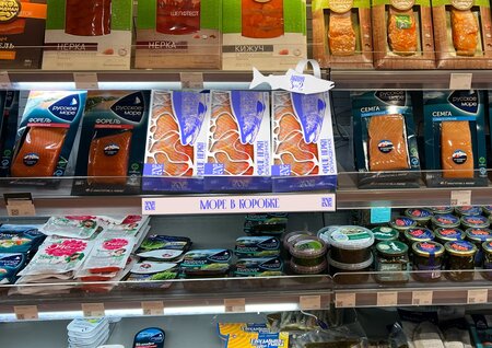
VOSTOK is a company engaged in the production, supply and sale of seafood found in the Vladivostok region, as well as farmed at local aquaculture farms. Our idea is to bring the sea to your home in an honest and transparent way.
Who the brand is for
- Residents of major Russian cities; - People aged 25–45 with a stable income; - Young families who want a «restaurant at home» without complicated cooking; - An audience that is sensitive to the quality and origin of the product.
From the point of view of communication theory, we immediately define the audience as part of the context on which the meanings of our messages depend (communication as a process across different contexts).
Brand message
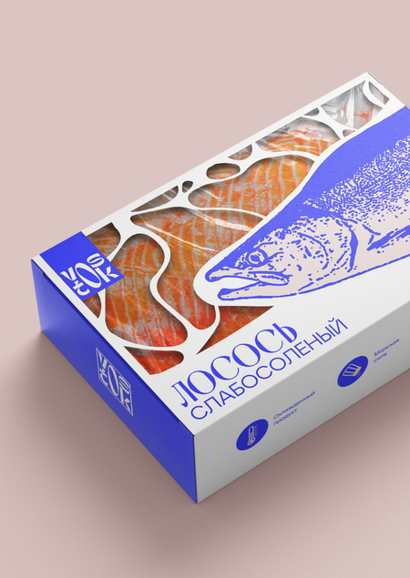
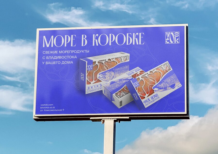
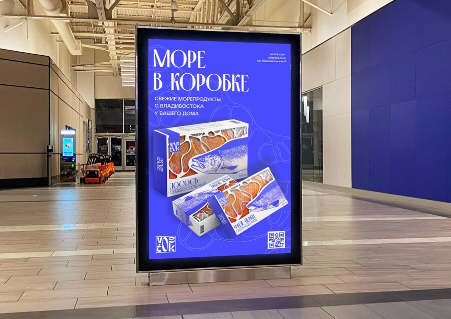
Main slogan: «The sea in a box.» Supporting slogan: «Fresher only in the sea»
Through these slogans we: - Use the narrative paradigm — we tell the story of how a piece of the sea moves into an ordinary apartment; people perceive brands as stories, not as a set of facts; - Define values: freshness, transparency of origin, respect for the sea, care for oneself and loved ones.
Brand values
- Transparency of origin — we emphasize the region and supply chain. - Care for the sea — sustainable fishing and farms that follow environmentally responsible standards (this is supported visually through a clean color palette and «breathing» layouts). - Home ritual — VOSTOK tells the story of a «family dinner with the sea on the table.»
The sociocultural tradition appears here in the way the brand becomes part of everyday practices (shopping at the supermarket, evenings with friends, family dinners) and helps to reproduce the idea of a «good life.»
3. Presentation for a professional audience (designers)
Brand platform and positioning
Category: mid-to-upper price segment seafood.
Positioning: «VOSTOK is a brand that turns the distant Far East into a familiar and safe part of everyday food consumption, while preserving the feeling of the real sea.»
From Craig’s perspective, we look at the brand through several «lenses» at once: - semiotic (the language of signs), - sociocultural (practices and context), - critical (the ideology of consumption), - rhetorical and digital rhetoric (the persuasiveness of messages across different channels).
Visual strategy (semiotics + visual rhetoric)
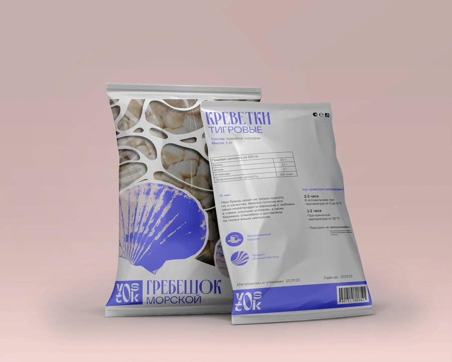
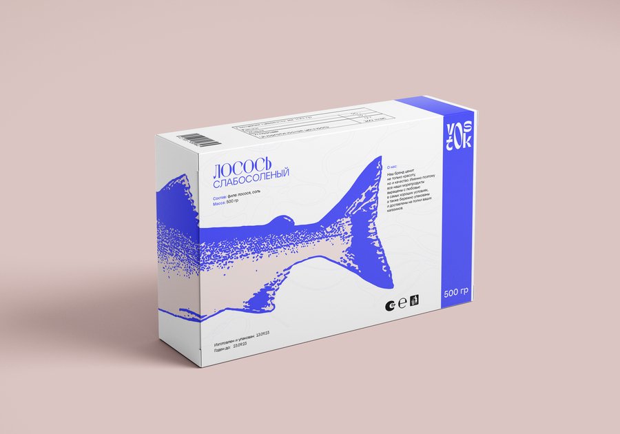
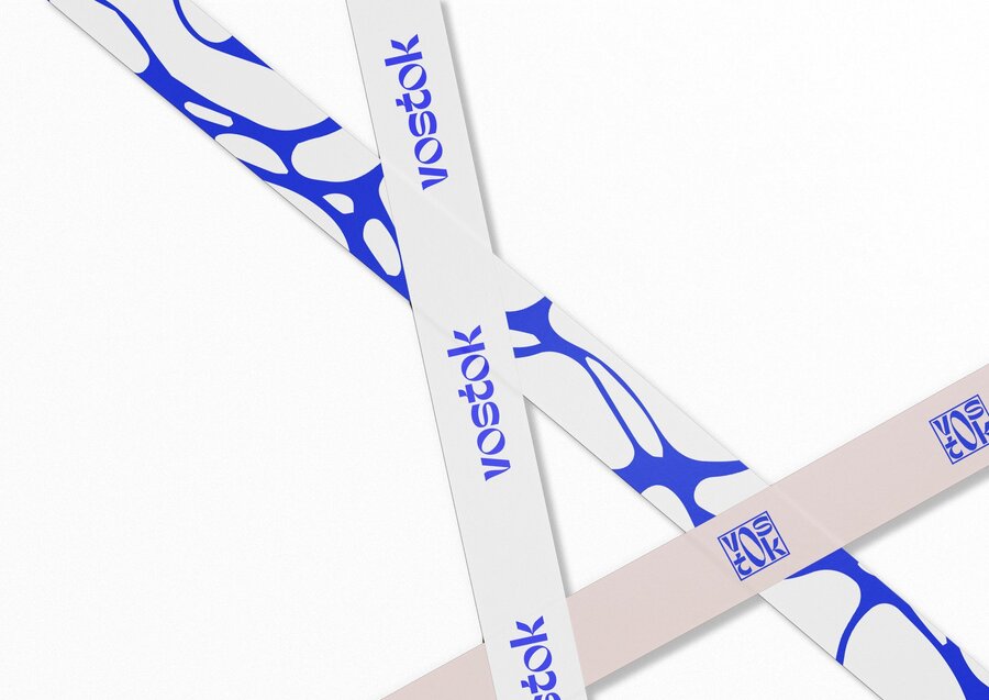
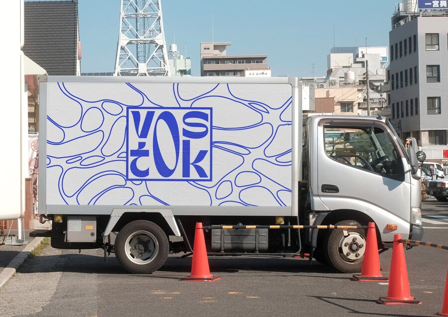
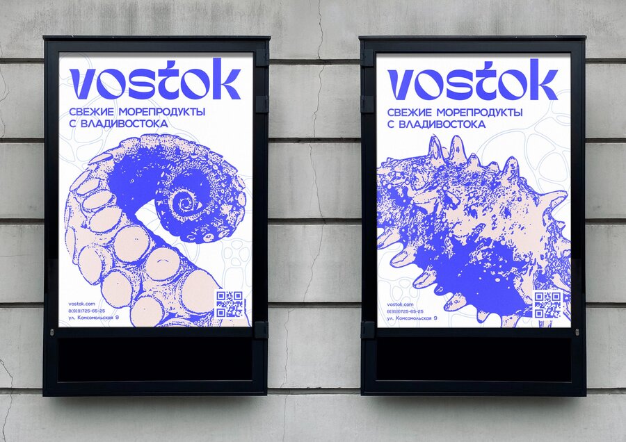
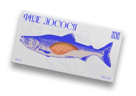
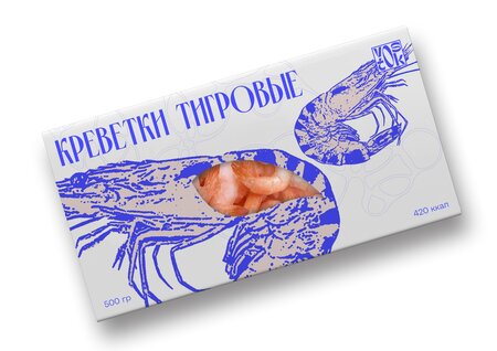
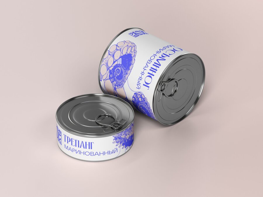
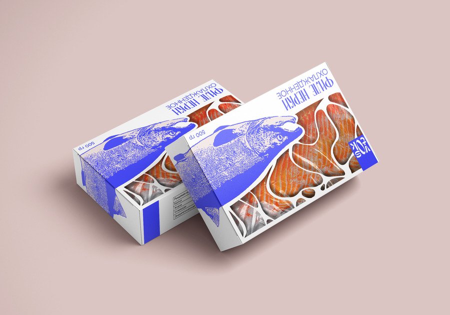
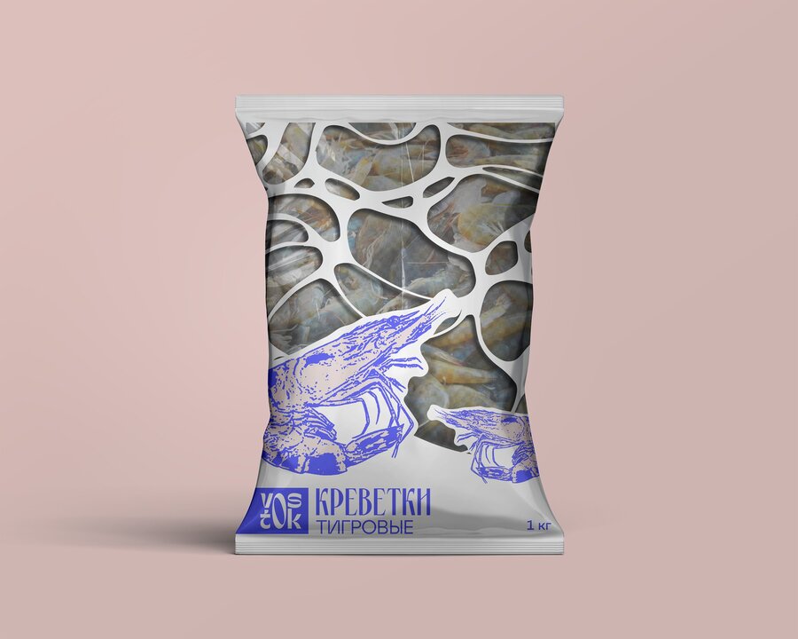
Color palette - Deep blue — a code for the sea, icy freshness, and trust. - Warm light pink background — a code for home and comfort.
Graphics and illustrations - Monochrome illustrations of fish, shrimp, scallops and sea cucumbers in a linocut-like style — visual markers of the real appearance and diversity of marine fauna. - An organic pattern over the window of the package — a metaphor of a sea wave and foam.
Here the semiotic tradition is at work: advertising sends out meanings without naming them directly, and the consumer reads them through already existing cultural codes.
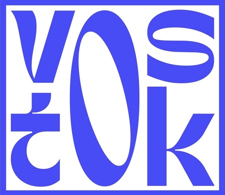
Logo - A square VOSTOK mark as a stamp of origin — a «guarantee» and «signature» of the producer (ethos in rhetoric).
Verbal strategy and rhetoric
We consciously structure our messages through the three components of persuasion:
- Logos — rational arguments: region of origin, ingredients, storage conditions, shelf life. - Ethos — trust in the brand: strict typography, transparent information, consistent visual language. - Pathos — emotion: the story about the sea and Vladivostok, the dream of «a piece of the sea in your kitchen».
In digital channels (website, social media) we rely on digital rhetoric: the same classical rhetoric transferred into the digital environment, where speed, interactivity and the visual layer are crucial
Sociocultural and critical layer
Sociocultural aspect. The brand supports the practice of a «home restaurant»: a person gets the opportunity to «eat as if by the sea» without leaving the city. This is an example of reproducing social order through communication — the idea that access to the sea is possible through the right brand becomes the norm.
Critical aspect. Drawing on the critical tradition and the Frankfurt School, we are aware of the risk of the commodification of nature: the sea turning into a product and a beautiful picture.
In our strategy we minimise this risk by: - avoiding aggressive «discount at any cost» triggers as the dominant message; - including educational content about the sea and its ecosystems in digital channels.
4. How we arrived at the strategy (linking theory and practice)
Choice of approach
We work within an interpretive logic: we do not measure sales, but interpret meanings and build the strategy as a set of meaningful messages embedded in a cultural context.
From the definition of communication to the brand
We take the definition of communication as a process of creating meaning through symbols and interaction in context.
We understand the VOSTOK brand as a system of messages: packaging, outdoor advertising, digital.
For each element we define: - who the sender is (the VOSTOK company), - who the receiver is (specific audience segments), - through which channel the message is delivered, - which symbols and meanings we want to create.
Choosing Craig’s traditions
Out of the seven traditions, we consciously rely on four: - Semiotic: for working with color, illustration, pattern and logo as a system of signs. - Sociocultural: for analysing consumption rituals and the image of the «good life» into which we embed the brand. - Critical: for reflecting on what ideology we are transmitting (our attitude to nature, to consumption, to the role of regions). - Rhetorical / digital rhetoric: for constructing persuasive messages (slogans, texts, storytelling, the brand’s behaviour in social media).
Theory in the design process
Research stage. - Analysis of existing category codes (what meanings are already associated with seafood). - Defining which social practices we want to support or change (sociocultural analysis).
Concept stage. We shape the key brand narrative based on the narrative paradigm: people perceive stories better than a set of arguments.
Visual language stage. We check each visual element through a semiotic lens: what will be read as a sign of freshness/trust/home?
Critical review stage. We look at the project through the lens of critical theory: are we reinforcing unwanted hierarchies, are we turning the sea into a purely decorative object?
Digital strategy stage. For social media and the website, we assemble a system of messages taking into account the rules of digital rhetoric: speed, interactivity, and visual dominance.
Course «Communication Theory: Bridging Academia and Practice»: lectures 1.1–1.6, 4.4–4.5; module on critical theory, Marxism and the Frankfurt School (ideology, culture, culture industry, public sphere) [Electronic resource]. — Electronic text data. — 2025. Accessed 03.12.2025.
Griffin, E. A First Look at Communication Theory / E. Griffin. — New York: McGraw-Hill, 2012. Accessed 03.12.2025.
Dainton, M., Zelley, E. Applying Communication Theory for Professional Life / M. Dainton, E. Zelley. — Thousand Oaks: Sage, 2015. Accessed 03.12.2025.
Zavorotniuk D. Educational project «VOSTOK brand: packaging and visual identity» [Electronic resource]. — Available at: https://hsedesign.ru/project/91596738d90a4eaebc2ead3407e3c40c. (accessed 03.12.2025).
Zavorotniuk D. Educational project «VOSTOK brand: visual media and communication» [Electronic resource]. — Available at: https://hsedesign.ru/project/a0aefc9bf739405f86509168dd044e10. (accessed 03.12.2025).
Online photograph used in the project [Electronic image: 38daf1e4a7004a6cc07eecc1d80b6b66.jpg]. — Source: open internet, (accessed 03.12.2025).
Online photograph used in the project [Electronic image: c5439070c574f72f504b68f9acb8d908.jpg]. — Source: open internet, (accessed 03.12.2025).
Online photograph used in the project [Electronic image: f985f2b2f3aa13c42aa5f3ce52ae6f72.jpg]. — Source: open internet, (accessed 03.12.2025).

![Strix [Safe Objects]](https://files.mediiia.ru/projectimages/1938/c66a4860d5724c42be05b58e761f1fc0/14f9df4a19f84695b6f0d4fbc514a4c9220x309.jpg "Strix [Safe Objects]")

