Communication theory: recover
Communication theory in the field of design
To begin with, it is important to note that communication theory is not a single theory, but rather takes shape through a combination of multiple approaches. How is meaning created? How does an audience interpret it? How does communication shape social relationships, identity, and power? In the context of design, communication is not the transmission of information, but the construction of meaning through visual codes.
According to the conventional transmission model, communication is understood as a process of sending and receiving messages, or transferring information from one mind to another. [1]
In his work «Communication Theory as a Field, ” Robert T. Craig argues that communication is a practical discipline, not only a theoretical one. The author identifies seven traditions of communication: rhetorical, semiotic, phenomenological, cybernetic, social-psychological, sociocultural, and critical. As in any design project, it is crucial how a product interacts with its audience. Communication should be understood as a field of dialogue between different traditions, rather than as a single universal model that can be applied to all design projects. I approach brand design as a form of communicative practice in which visual decisions participate in social dialogue. Thus, a logo can be associated with semiotic communication, brand storytelling with rhetorical communication, the author’s subjective experience with the phenomenological tradition, and design aimed at a specific target audience with the sociocultural model. In essence, design is never neutral; on the contrary, it enters into close interaction with the world.

polygraphy
Communication is always a process embedded within specific social structures. The same brand communicates differently in opposing social contexts. For example, the design of a carpet care brand is universal and largely suitable for various social groups. Such a brand can be identified by several factors: an affordable price, a clear consumer need for the product, and its suitability for different modes of use. In this case, the brand addresses a general audience and communicates the message «we are for everyone.» In contrast, there is an opposing model — a brand designed for professionals, which communicates «we are one of you». A brand functions as a social actor that enters into relationships with its audience and occupies a specific position within culture.
polygraphy
It is also important to consider the work of Rodger W. Griffeth, «Equity Theory and Interpersonal Attraction» The key idea of this theory is that people evaluate relationships according to the principle of what they invest and what they receive in return. When applied to design, this means that users should perceive a product’s communication positively. Essentially, product design should establish an open dialogue with its target audience, and communication should be honest, transparent, and non-manipulative. The visual language must correspond to the product’s actual value: an overly «premium» visual appearance without substantive content is perceived by users as an imbalance. The audience should develop trust in the product through visual communication. Design must offer something meaningful, rather than merely presenting an attractive surface. Ideally, a brand offers information, aesthetics, and identity, while the audience contributes attention, trust, and loyalty.
Within the framework of communication theory, design is understood as a social practice in which visual images act as mediators in the exchange of meaning between a brand and its audience. Through the course, it becomes possible to analyze how design shapes trust, identity, and social relationships.
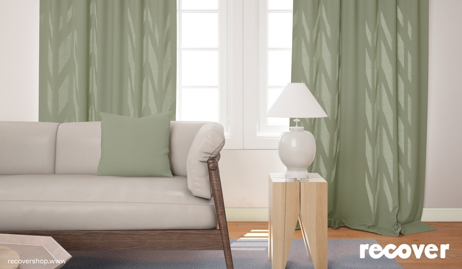
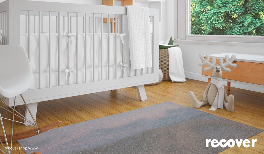
Presentation of your brand for a general audience
advertising banner
Connecting with nature is a conscious choice: using only recyclable materials that give a second life to things.
The Recover brand is about being mindful of what’s beneath your feet. It’s about finding peace of mind knowing that the comfort of your home doesn’t harm the environment.
offline store
The space of our stores is designed to provide comfort and respect for nature.
In our stores, you will find a carpet for every taste, from a children’s room to a living room. Most importantly, it is an item that was made with the planet in mind.
Each carpet model is a responsible choice that demonstrates your values.
an example of a product in space
To ensure that your product receives the care it needs, we have created a special care line.
Our eco-friendly carpet cleaning concentrates effectively remove dirt while maintaining environmental safety. The line offers a wide range of products designed to extend the life of your carpets.
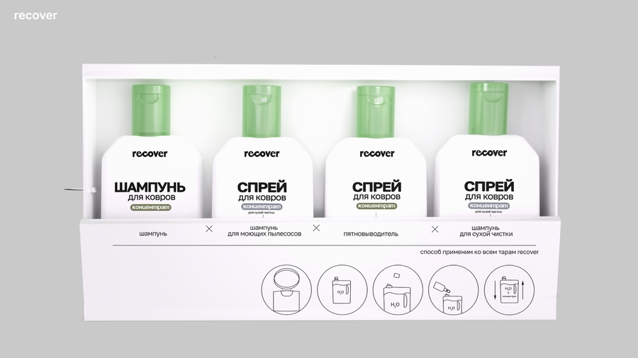
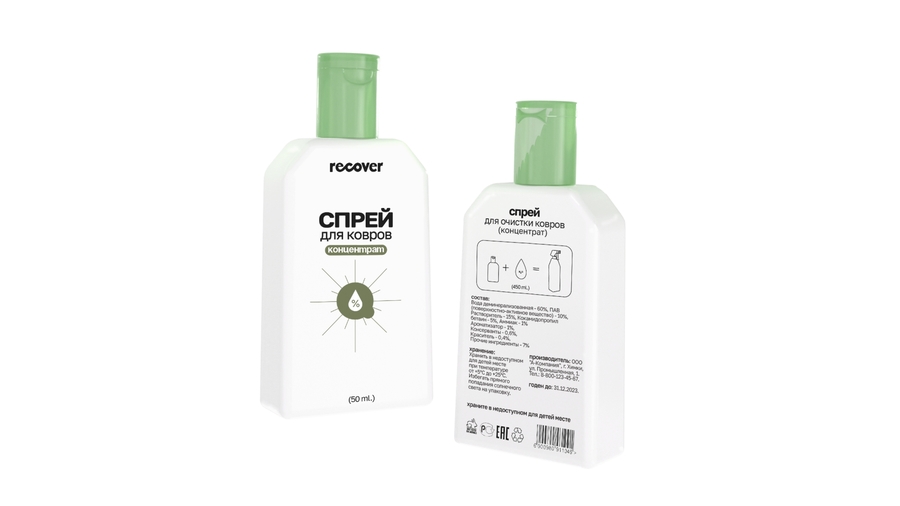
FMCG segment products
Presentation of your brand for a professional audience
The logo The logo of our brand is a visual formula of our values. The soft, streamlined shapes symbolize the comfort, safety, and coziness that we put into every carpet.
At the same time, the font is based on a modern grotesque that represents high-tech production.
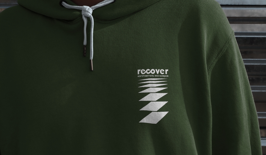
branded products created to promote a company
Graphical constants We use a modular principle: geometric blocks that repeat the shape of the carpet. They are duplicated, combined, and live in different combinations, visualizing the key idea: nothing is lost, only reborn. This is a visual formula for recyclability
Color palette Color Palette Our color palette is intentionally minimalist. White, black, and green are our signature colors. They symbolize purity and awareness of nature.
The color is not dominant here, as the main «colors» in our communication are nature photos that have been specially processed to resemble the texture and depth of a carpet. The nature photos are combined with clean typography and modular graphics.
polygraphy
Content Copywriting is very important in our identity. We write with special attention to materials, because our goal is not just to inform, but to convince at the level of facts and values. On posters and in descriptions, we explain in detail what the carpet is made of, what the recycled fibers have been through, and why it is safer and more responsible
POS-materials
branded products created to promote a company
Promotion
We place advertising and POS materials in the most visible and passable places, because our goal is not just to sell a carpet. We are changing the paradigm of choice.
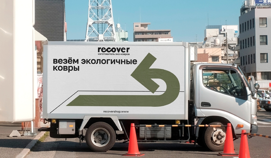
truck and workers' uniforms
How communication theory served as the basis for creating a presentation
General Audience Engagement When creating communication for a wide audience, we focused on the emotional profit of consumers and personal benefits: the conscious choice of people to feel harmony and connection with nature through an environmentally friendly product made from recyclable materials. To do this, we also turn to specific images of peace of mind when choosing a product, as an act of responsibility and caring for ourselves and the environment. Photographs of nature, processed to match the texture of the carpet, are used as a visual sensation. The metaphor of the fusion of natural and final product in comparison of the sensations of its use. In communication through space, we pay attention to creating an arrangement through the balance of natural motives and modern technologies that immerse a person in special conditions that help to reconnect and experience the product even before it is purchased.
Professional Audience Engagement When creating communication for a professional audience, the main focus was to create a sense of value and solve consumer problems through quality, innovation and compliance with stated standards (a product made from recycled materials and environmentally friendly care products). To do this, we use a strict set of graphic elements showing the processes of creating carpets from recycled materials. Modularity and soft geometry create a sense of thoughtfulness and product quality.
If the positioning of pleasant and natural sensations is for a wide audience, then for the second group it is an emphasis on certified processed raw materials and thoughtful production processes that guarantee quality and durability.
Message Design Logics
1. Expressive It is practically not used in its pure form. The brand is not «spontaneous» and «direct», on the contrary, it is carefully constructed through the rigor of forms and a clear hierarchy of graphic elements showing production technologies, responsibility and thoughtfulness of details. Emotionality begins to manifest itself at the level of using nature photographs processed to match the texture of the carpet, which creates a sense of connection between the buyer and the recycled materials, that is, it uses more in communication with the General Audience.
2. Rhetorical a) General Audience: creating emotional engagement of the customer from a sense of unity with the product and the company’s values: environmental friendliness, responsibility and connection with nature. b) Professional Audience: the focus is on the quality and role of materials in the design of carpets and their care products.
3. Conventional a) General Audience: following the positioning of an eco-friendly lifestyle and brand reliability b) Professional Audience: communication through demonstration of compliance with production standards and the use of innovative technologies
Equity Theory
According to J. Stacy Adams' statement of equity theory, individuals seek to maximize equity in relationships rather than to maximize raw outcomes.[2]
Equity Theory is based on balance: a person compares the ratio of their investments and the results they receive. According to this theory, it was important for us to build a logic of communication and an honest dialogue through the client’s understanding of his investments and results after the purchase, which are based not on maximum benefit, but on a fair exchange of goods. Thus, the purchase of a Recover carpet is like a social exchange, where the customer receives not only a carpet, but also compliance with the brand’s values: environmental friendliness, a sense of unity with nature and concern for the environment through the choice of a product from recyclable material. This ensures an even distribution of costs and rewards for the purchase.
Since fair trade is important in Equity Theory, when implementing it in our brand’s communication, we emphasized that the client would receive a high-quality and durable carpet that was created with minimal damage to the environment.
To make the benefits as tangible and understandable as possible, branding and media are based on a metaphor that shows the production processes. This way, on advertising posters, the buyer is informed how the fiber processing process takes place, from which materials and why it is safer and more environmentally friendly. The important task here was to show the key idea of the brand: nothing is lost, only reborn.
Social Exchange Theory
According to this theory, when buying a Recover carpet, the consumer enters into a special relationship with the brand, which is based on the exchange of values, rational calculation of benefits and costs.
The main objective of the brand’s communication and goals is to maximize rewards and benefits for the customer, especially emotional ones. Thus, through the logo, where strict grotesque and soft forms are synthesized, a sense of pleasure, conscious and responsible choice of an innovative product is conveyed.
Modular graphics, which take into account the strict sequence of graphic elements, helps to convey not only technical features, but also the process of brand and consumer exchange. Speaking about purity, clarity and awareness in brand positioning, we use three colors, reducing visual noise and creating a sense of mutual exchange without overloading consumer perception.
Robert T. Craig Communication Theory as a Field. — 1 изд. — Reserch Gate, 1999. — 44 с.
Rodger W. Griffeth; Robert P Vecchio; James W Logan Equity Theory and Interpersonal Attraction. — 1 изд. — Journal of Applied Psychology, 1989. — 401 с.
Equity Theory // edu hse URL: https://edu.hse.ru/login/hselogin.php?errorcode=4 (дата обращения: 14.12.2025).
Social Exchange Theories // edu hse URL: https://edu.hse.ru/mod/page/view.php?id=513238 (дата обращения: 14.12.2025).
All pictures are from Yulia Subbotina’s projects: https://portfolio.hse.ru/Project/188344 (дата обращения 14.12.2025)
https://portfolio.hse.ru/Project/195820 (дата обращения 14.12.2025)


