Слой — это пекарни, которые дополняют повседневность и открывают людям многослойность моментов жизни. Здесь собрана команда энтузиастов, объединённая идеей поиска лучших рецептов и технологий для создания нового вкуса привычной выпечки. Именно это мы и отразили командой агентства ENDY.
Смелость и динамика логотипа
Слой — это новая школа выпечки и постоянный поиск нового.
Ведь новизна придаёт жизни вкус. Шрифтовой логотип с наклоном передаёт смелый и даже немного дерзкий характер бренда. Динамика и движение отражают непрерывное совершенствование.
Авторский знак напоминает знак копирайта и круассан в разрезе, что указывает на авторский подход и уникальность опыта, получаемого от вкуса выпечки.
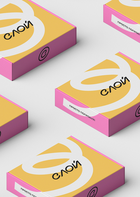
Дружелюбная и вкусная цветовая гамма
Цветовая палитра фирменного стиля основана на кулинарных решениях. Каждый цвет — олицетворение начинки круассанов, эклеров и другой выпечки.
Метафоричный завиток
Основным графическим элементом стал «завиток». Динамичный, с прямыми концами, он является метафорой процесса замешивания теста и закручивания круассанов.
Упругая форма линии имеет плавный характер движения. «Завиток» используется на носителях в единственном числе.
Стильные иконки
Метафору современного и слегка дерзкого бренда дополняют иконки, используемые для навигации. Формы иконок созданы с помощью линии, которая имеет фирменный завиток или динамичный характер.
Открытый и честный бренд
Сегодня бренды всё чаще демонстрируют в соцсетях идеальную картинку: безупречная команда, волшебные круассаны, замечательные и доброжелательные гости. Но ведь люди устали от этого.
Мы открываем закулисье, знакомим с командой, нашей историей, показываем все процессы и раскрываем тайны. Но не превращаем аккаунт в секретный закрытый клуб, а выступаем в роли места объединения друзей, где всегда рады новеньким.


